


UX/UI Design in Raleigh NC
In a competitive e-commerce landscape, I transformed Retro Modern Furnishings’ underperforming website into a conversion powerhouse through strategic UX design and research. By reimagining the site’s navigation and information architecture, I delivered measurable business results: a 175% increase in checkout completion and 217% growth in conversion rates year-over-year.
TEAM: Solo project
ROLE: UX Designer, Researcher, and website builder
TOOLS: My primary design tool was Figma, complemented by Adobe Illustrator. Research tools included Mural and Smaply.
PLATFORM: Responsive Shopify website
CLIENT: Retro Modern Furnishings
Lead stakeholder: Kelly Wohlgenant, Founder
PROJECT DURATION: 3 months
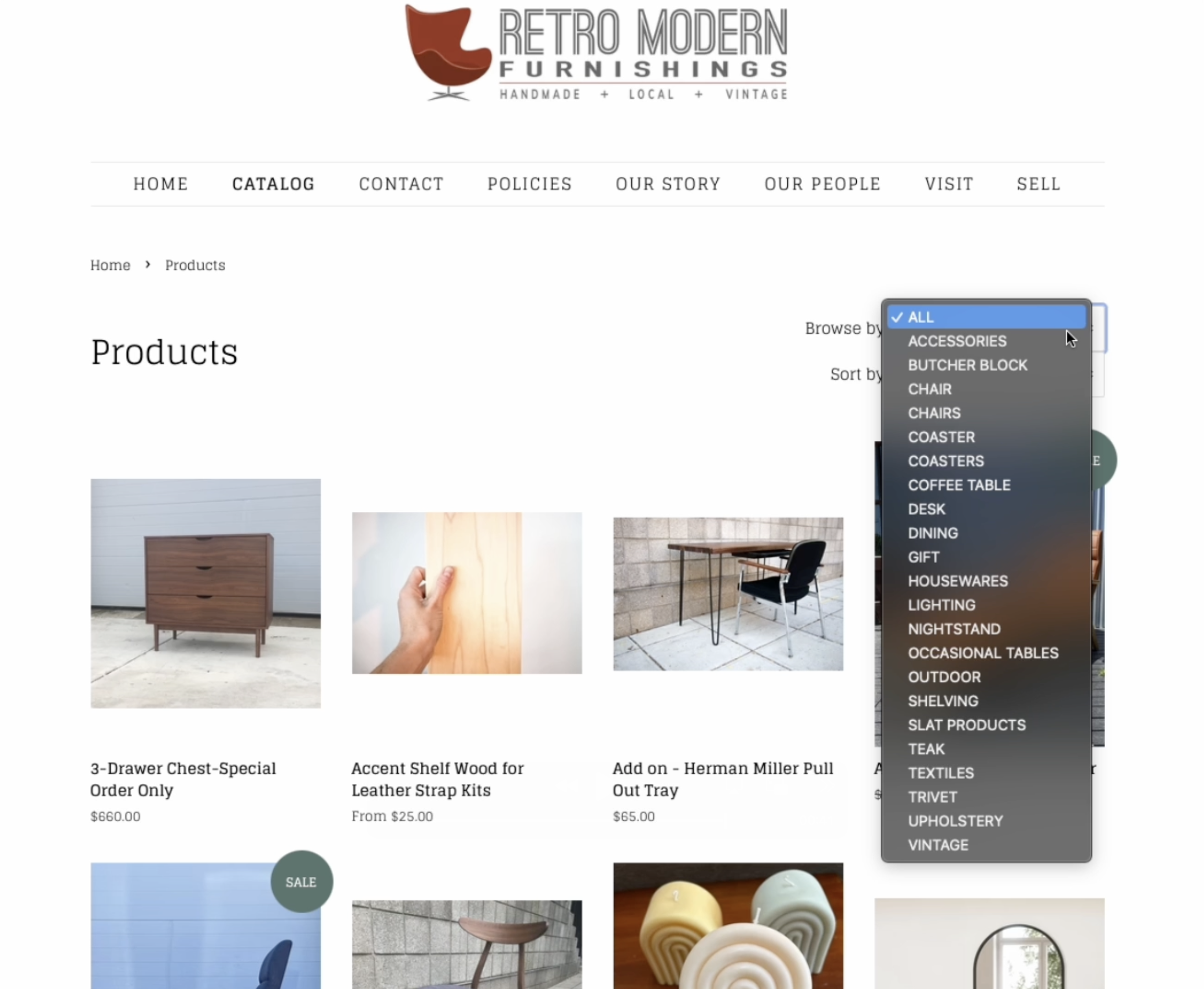
before redesign:
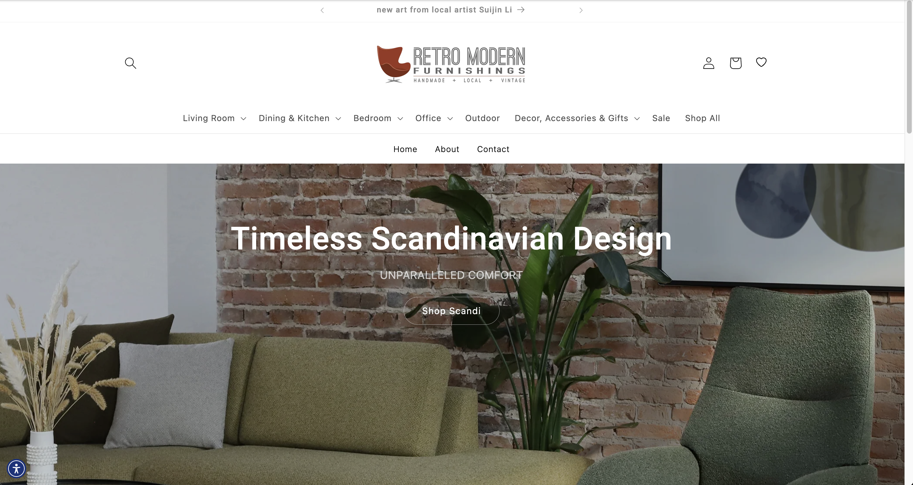
after redesign:
How might we simplify product categorization to align with users’ mental models?
How might we streamline the checkout process to reduce cart abandonment?
Client Background
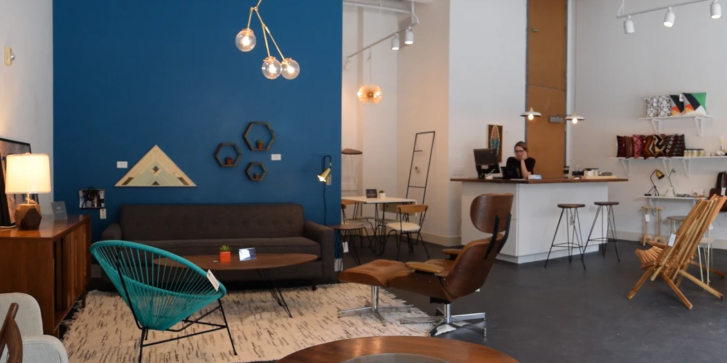
Despite a loyal local following of design enthusiasts, their existing website failed to capture the brand’s essence and struggled with low conversion rates, hindering online sales and expansion beyond the local market.
Research
Executed comprehensive user research through stakeholder interviews, journey mapping, card sorting, terminology testing, competitive analysis, and heuristic evaluation to inform design decisions
Design
Developed high-fidelity wireframes and interactive prototypes informed by research insights, while creating scalable design systems for consistency
User Testing
Conducted and analyzed unmoderated usability tests to validate design decisions and identify areas for improvement
Iteration
Implemented multiple design refinement cycles, incorporating user feedback and testing results to optimize the user experience
QUANTITATIVE ANALYSIS:
Evaluated key performance indicators (KPIs) pre- and post-redesign, including conversion rates, time on task, and checkout completion, to measure impact
I conducted user interviews, synthesized website analytics, and performed competitive analysis. Initial assumptions about user preferences were challenged, revealing a need for a more intuitive categorization system and product filtering.
Identify Usability Challenges:
Pinpoint critical usability issues within the current website to enhance user experience.
Understand User Mental Models:
Gain insights into shoppers’ mental frameworks regarding product categorization in the furniture shopping process.
Evaluate Website Performance:
Assess current performance metrics, including bounce rates, time on task, checkout rates, and conversion rates, to establish a baseline for improvement.
Investigate Cart Abandonment:
Uncover underlying factors contributing to cart abandonment to inform targeted design solutions.
Recognizing the critical role of a strategic digital presence, this research phase aimed to deeply explore Retro Modern Furnishings’ current challenges, brand positioning, and untapped potential in the competitive furniture e-commerce landscape.
Methodologies to understand the business needs included:
✦ 1. Stakeholder Interviews

I interviewed the key stakeholder and staff about the known website issues and their understanding of their customer base.
Key insights included:
✦ 2. Competitive Analysis
Key insights included:
✦ 3. Heuristic
Evaluation
Key insights included:
Online shoppers struggled with navigation, product discovery, and understanding the unique value of Retro Modern’s offerings.
Methodologies to understand the business needs included:
✦ 1. Unmoderated Baseline Usability Testing & Analytics Review
Usability testing confirmed critical navigation issues and search inefficiencies, leading to high abandonment rates and forcing very determined users to manually browse entire product catalogs.
Analytics review confirmed high cart abandonment.
I know exactly what I want, but it's frustrating when what I type in doesn't match the furniture I'm looking for. Everything is labeled with technical sounding names.
✦ 2. User Interviews and Customer Reviews:
I conducted user interviews, surveys and explored customer reviews and looked for commonalities to determine what their users value.
Themes included:
✦ 3. User Journey Maps, Personas & Storyboards
Journey Maps and story boards helped to visualize the user journey and pain points, and brainstorm ideas for improvement.
I also created personas to help me keep the target customer front of mind while designing.
Improvement ideas included:
✦ 4. Open Card Sorting & Terminology Testing
These methods helped me understand users’ mental models and find patterns in how users expect to find content
Themes included:
Market
Expansion
Extend brand reach beyond Raleigh by highlighting unique artisan craftsmanship and curated vintage collections through an intuitive digital platform.
Optimized Navigation Strategy
Align website navigation with users’ room-based mental models to reduce friction and potentially increase conversion rates.centric.
Craftsmanship
Storytelling
Showcase local artisan quality and vintage collection uniqueness to create opportunities for increased average order value.
User Engagement Enhancement
Streamline product communication by eliminating industry jargon and creating clear, accessible product descriptions to reduce bounce rates.
During the design phase, I focused on translating research insights into effective solutions that addressed user needs and business goals.
Throughout the process, I iterated based on stakeholder feedback and conducted usability testing to refine the design. Special attention was given to creating a responsive design that would work seamlessly across desktop and mobile devices.

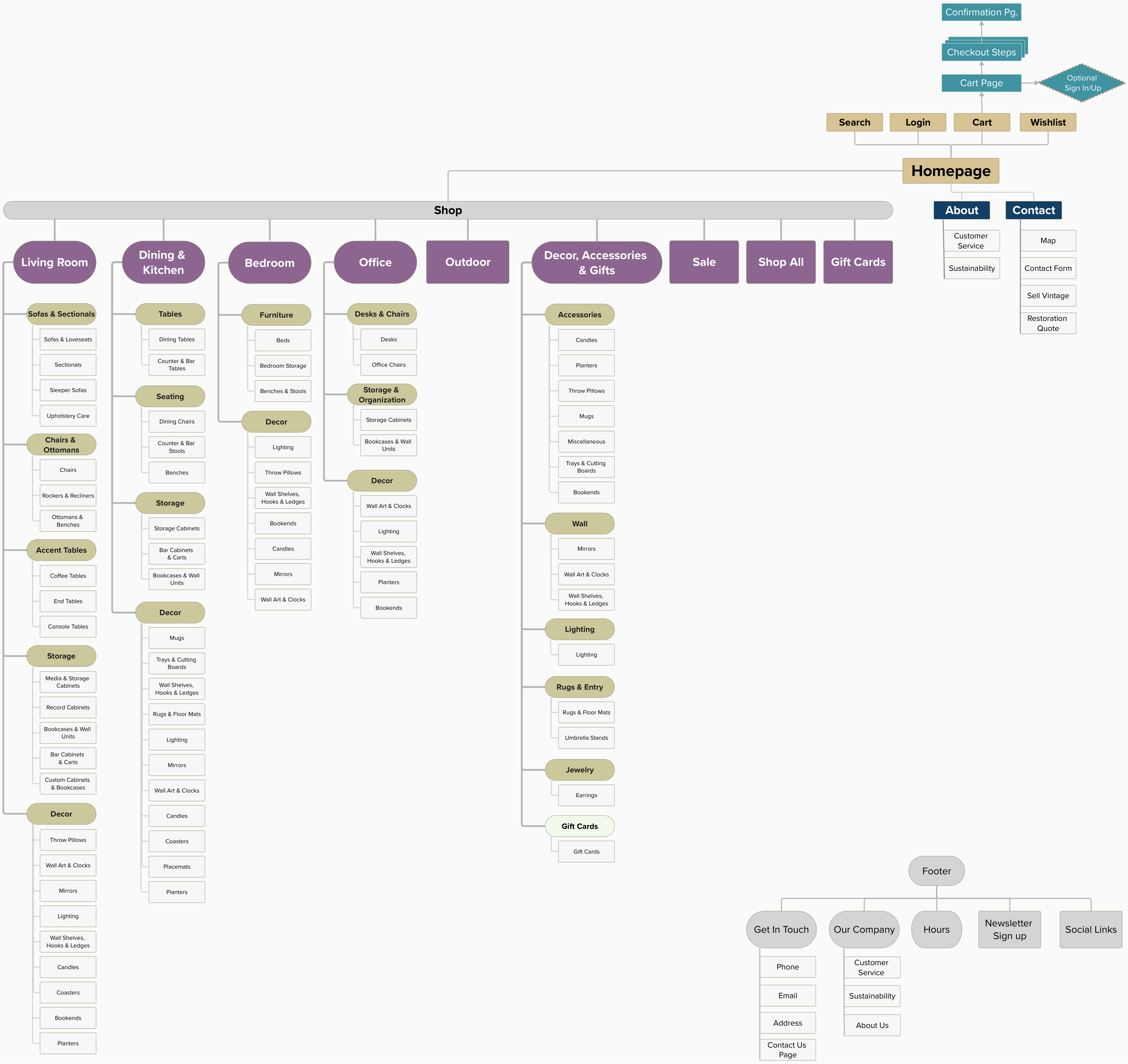
Based on the card sorting exercises and other user research to uncover user’s mental models, I restructured the site’s navigation to align with users’ room-based mental models. The new information architecture features:
The resulting site map creates a clear, user-friendly navigation system that helps customers find furniture more easily. By organizing content in a way that matches how people naturally think about shopping for home furnishings, I made the website more intuitive and enjoyable to use.
Strategic homepage links now highlight unique offerings like vintage collections, custom furniture, and local artisan pieces, immediately communicating the brand’s distinctive value proposition.
This strategic decision was driven by several factors:
Adopting this pragmatic, agile methodology ensured that the final design would be both user-centric and feasible within the client’s chosen e-commerce platform.
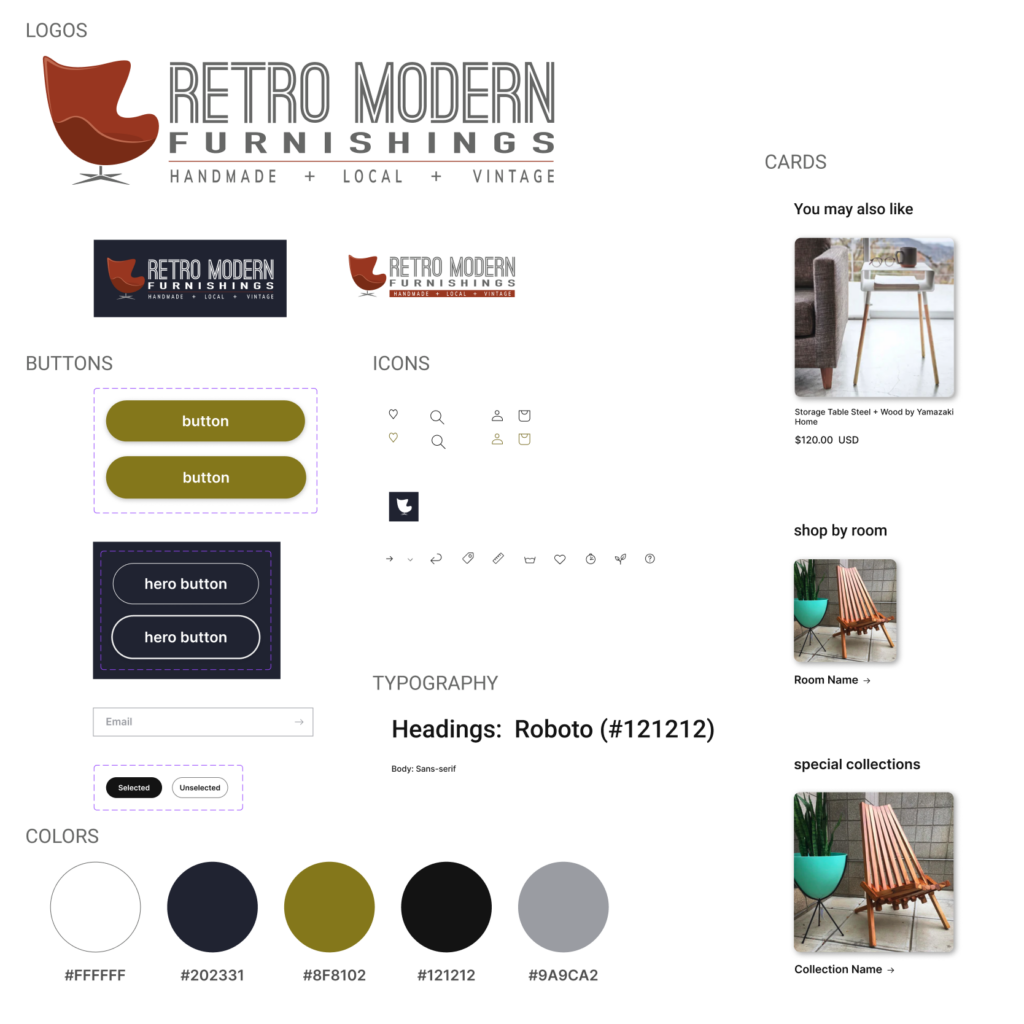
By creating this systematic approach to design, I established a scalable framework that enhanced brand consistency, simplified future design iterations, and provided a unified visual experience for users.
Participants: 10 participants matching Retro Modern’s target demographic (ages 22-78 with modern aesthetic)
Testing Method: Participants completed predefined tasks while recording their screen and verbal thoughts
Tasks Included:
Evaluate the effectiveness of the new navigation structure
Assess the clarity of product information and categorization
Identify potential friction points in the user journey
Measure the ease of completing key tasks
Identify high-priority adjustments to improve the shopping experience
I love how easy it is to find exactly what I'm looking for. The website design feels modern and thoughtful.
It's a bit confusing to tell which products are made by Retro Modern and which are just part of their collection.
The vintage collection is a game-changer. The special collections are great... I like being able to narrow down all the options without getting overwhelmed.
Navigation Effectiveness (83% Success Rate)
Users successfully navigated to room categories 83% of the time, with living room and bedroom sections performing strongest. The “Custom Made” subcategory presented minor wayfinding challenges, suggesting a need for more intuitive labeling.
Key Pain Points
– 40% of participants struggled to locate furniture that is custom made by Retro Modern
– 20% of users had trouble finding detailed product dimensions and specifications
Positive Discoveries
– Product imagery received high praise, with 100% of users finding visual representations clear and appealing
– Room-based categorization aligned well with users’ mental models of furniture shopping
Quantitative Highlights
– Average task completion time: 4.2 minutes
– User satisfaction score: 9.5/10
– Successful product discovery rate: 82%
Key Improvements:
Accessibility and Responsiveness:
These targeted enhancements aim to create a more intuitive, accessible, and user-friendly e-commerce platform for Retro Modern Furnishings, addressing both usability concerns and technical requirements.
65%
Increase in
Ave. Order Value
217%
Increase in
Conversion Rate
175%
Increase in
Checkout Completion
Conversion rate optimization strategies, including improved navigation, clearer product categorization, and enhanced user interface, directly contributed to these measurable outcomes.
The data validates the user-centered design approach and confirms the effectiveness of the comprehensive usability research and implementation.
The positive feedback aligns with key user research insights, demonstrating how strategic design can transform an e-commerce platform. By prioritizing user needs and implementing a thoughtful, user-centered approach, Retro Modern Furnishings has become a digital experience that resonates with its customers.
The website’s success stems from carefully balancing retro aesthetic elements with modern usability principles, ensuring an engaging and functional online shopping environment. This approach not only improves visual appeal but also enhances user interaction and product discoverability.
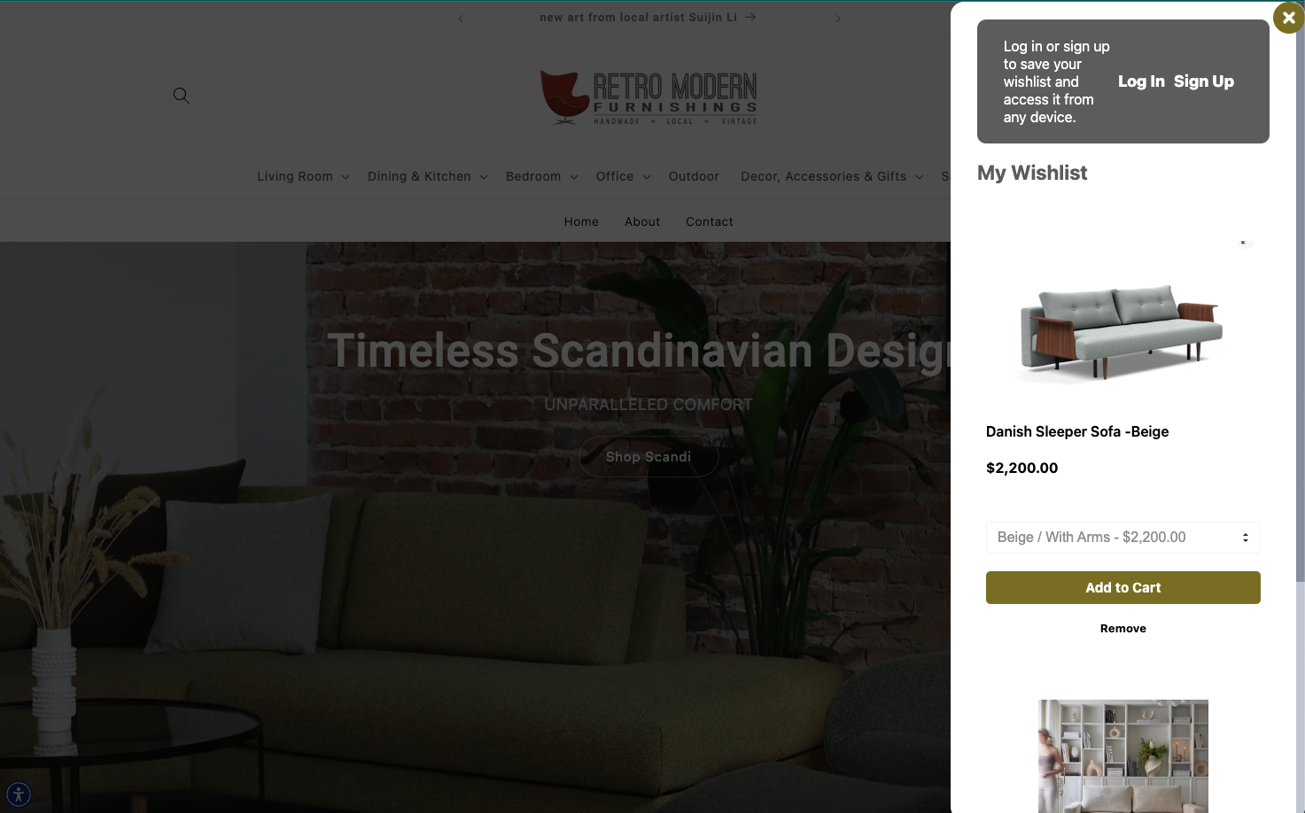
Customize menu bar to position core pages (Home, About, Contact) above the room-based mega menu, improving site navigation hierarchy and quick access to essential pages.
Showcase Local Makers
Enhance community focus by creating dedicated bio pages for local makers, featuring their stories, craftsmanship, and unique contributions to Retro Modern’s collection.
Highlight Custom
Produce and feature engaging video content demonstrating the in-house furniture-making process, highlighting the skill and artistry behind Retro Modern’s custom pieces.
Implement an augmented reality feature allowing customers to visualize furniture pieces in their own spaces using their mobile devices, enhancing the shopping experience and reducing uncertainty in purchase decisions
Appointment Booking
Implement a user-friendly online scheduling system allowing customers to book consultations with design staff directly through the website, enhancing personalized service.
Design Tips
Leverage staff expertise by creating a curated section of design tips, focusing on how to seamlessly blend vintage and modern pieces in home decor, reinforcing Retro Modern’s unique value proposition.

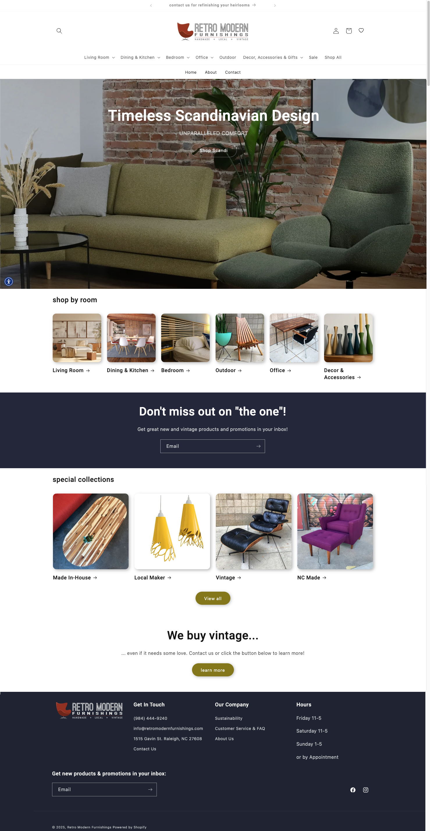
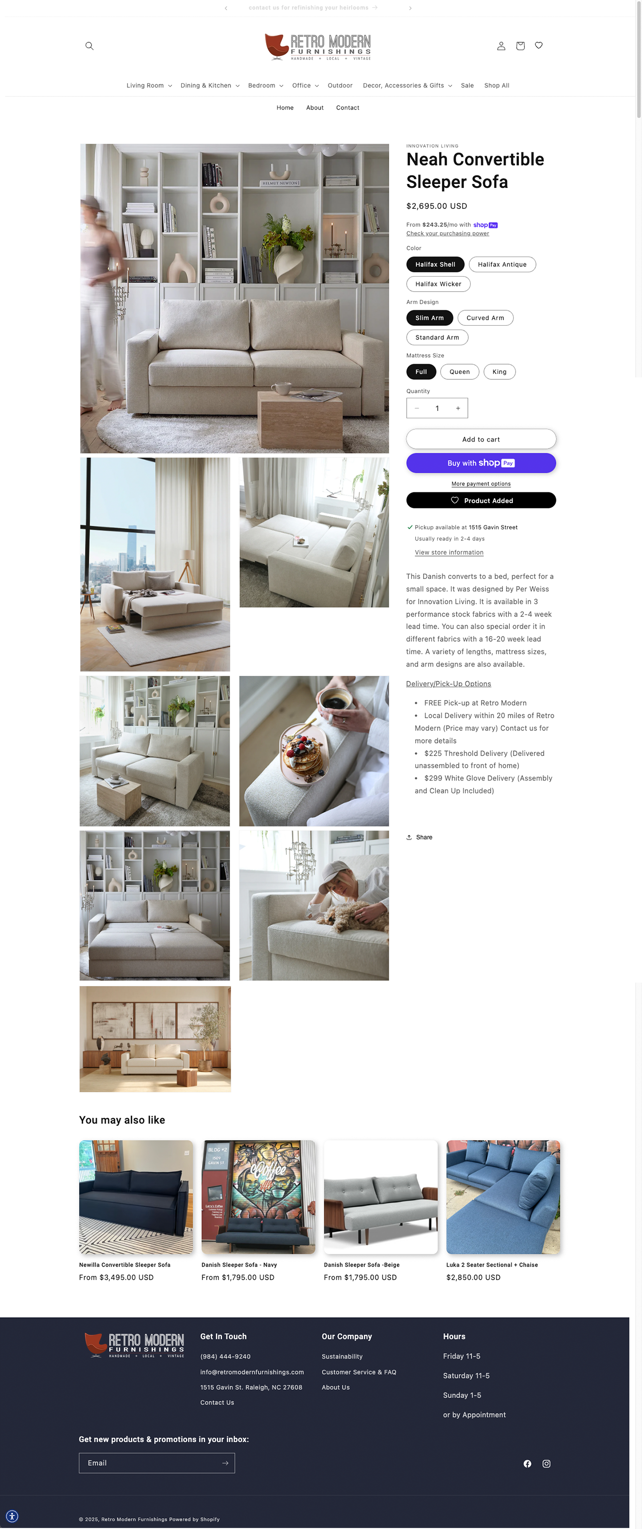

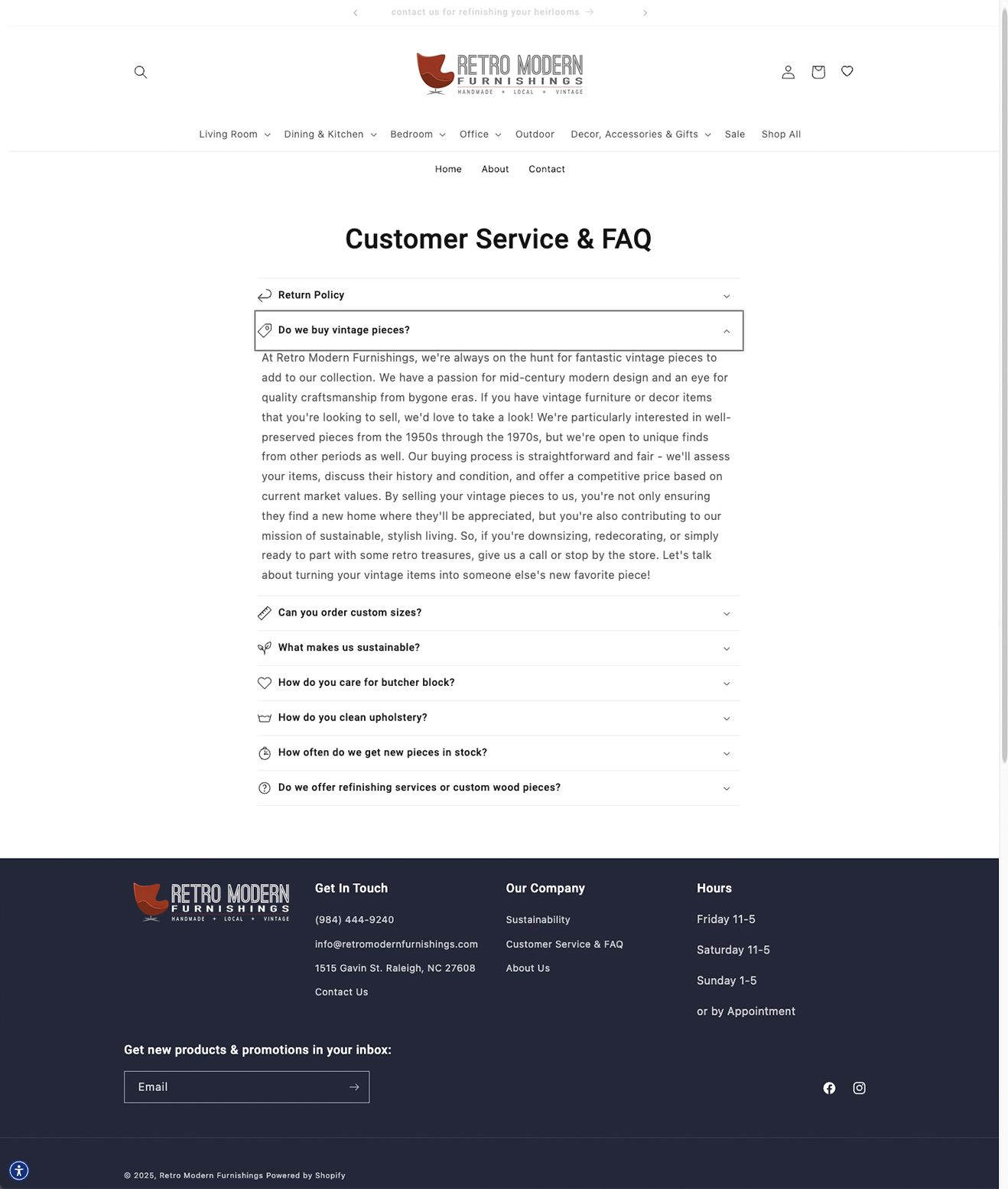
Explore the design of Retro Modern’s website at retromodern.shop
Feel free to reach out to discuss your project needs or explore how I can help create impactful, user-centered designs.