Loading

Website Redesign

Improving Site Functionality & Increasing Donations

Summary
GOAL:

simplifying the donation experience

We set out to reimagine Boulder Food Rescue’s online donation experience to be simple, accessible, easy to navigate, and responsive across various platforms. 

Details:

TEAM: I collaborated closely with 3 UX Researchers: Tracy Jerard, Ph.D., Mark Werner, Ph.D., and Xinyue Zuo.

ROLE: UX Designer, Researcher, & Writer
Responsible for: Design Thinking, Information Architecture, Research, User Flows, Wireframing, Visual / UI Design, Prototyping & Testing

TOOLS: My primary design tool was Figma, complemented by Illustrator and Photoshop.  We also used Miro, Zoom, Google Docs, and Slack to meet, share, and present ideas.

PLATFORM: Responsive website with a mobile-first approach

CLIENT: Boulder Food Rescue
Lead stakeholder: Hayden Dansky, Co-Founder & Co-Director

PROJECT DURATION: 3 months

The Problem:

BFR's website was hindered by poor mobile optimization, resulting in a cumbersome donation process and usability issues.

Hypothesis:

We hypothesize that a streamlined donation process will lead to an increase in donor conversions, thereby allowing Boulder Food Rescue to further reduce food waste and provide more healthy food to underserved communities.

How might we introduce BFR and its mission in a manner that resonates and connects with the user?

How might we inspire users to feel driven to make a donation?

How might we make the donation process as seamless as possible?

How might we best structure the website for driving traffic and fundraising?

The Solution:

We used continuous validation through user testing and iterative improvements to achieve the highest conversion rates.

Our vision for success included:

Background

Boulder Food Rescue aims to reduce food insecurity by collecting perishable food and delivering it to low-income communities.

Through donations and volunteers, Boulder Food Rescue collects perishable food from grocery stores, restaurants, and backyard donations and delivers them, via bicycle, to low-income housing and other places where people are already gathered.  Their volunteers recover 1,500 pounds of food daily and distribute it to about 17,000 people per year.

A vital resource for the community, Boulder Food Rescue relies on donations to fund their nonprofit, however, the donation process was not optimized.

As part of our Giving Back Project, we chose BFR to provide pro-bono UXR and design services, recognizing the crucial role of donations in supporting their mission.

PROCESS

+ phase 1: discovery & research

Summary of Process

Through UX research, design and user testing, we reimagined the donation flow.

  • I led the redesign of Boulder Food Rescue’s food rescue donation experience, working in collaboration with my team of 3 UX researchers. With our research insights in mind, I delved into the design phase.

🕵️‍♀️

Research
Through stakeholder interviews, site reviews, usability testing, heuristic evaluation, competitive analysis, and analytics review, we identified key issues and best practices. Stakeholder discussions highlighted the critical role of donations, leading us to prioritize enhancing the donation experience.

✏️

Design
I iteratively refined wireframes and prototypes, incorporating feedback from our team and users as I progressed from sketches to high-fidelity prototypes in Figma. The final design prioritized ease of navigation, clarity of messaging, and adherence to accessibility standards.

🧠

User Testing
Moderated usability testing sessions validated design changes with participants successfully navigating the prototype and providing valuable feedback. Insights informed further refinements, ensuring a user-friendly experience.

🔄

Iteration We iteratively refined the prototype based on feedback, focusing on enhancing usability, clarifying messaging, and ensuring accessibility.

📊

Report & Presentation

We created a detailed report and slide deck summarizing our research findings and proposed changes, which stakeholders welcomed enthusiastically. Future recommendations include a comprehensive website overhaul and consolidation of resources.

DISCOVERING THE NEEDS:

We began the research by interviewing Hayden Dansky, Co-Founder & Co-Director of BFR.  Here, we  identified areas of concern from their viewpoint.

Hayden gained insights into the organization and identified three main user types

Screenshot of a zoom meeting with the UX research and design team and the primary stakeholder
My awesome team!
Tracy Jerard, Ph.D. (UX research), Me (Lori Langdon, UX research/design), Xinyue Zuo (UX research), Hayden Dansky (Stakeholder), and Mark Werner, Ph.D. (UX research)
Site audit

We explored opportunities for the most meaningful impact and created a plan.

Team members individually reviewed the site on mobile and desktop from the perspectives of the 3 main user types identified by the stakeholder.  We then discussed our findings, concluding that the most room for improvement could be found with the community resources page, and originally decided to focus on the user journey of attaining food resources. This page was visually cluttered and difficult to navigate (especially on a mobile device) and did not provide a clear path as to how to get food.

BASELINE USABILITY TEST

Study participant found the flow "visually jarring", difficult to use and "discouraging to interact with”.

Next, we conducted usability testing of the existing website with one participant using a mobile device. We asked the user to talk us through how they would go about locating food if they were in need. Our main goal with this testing was to assess for any changes that we should include in the re-design. The user’s thoughts echoed our own that the resources page was overwhelming and unclear.  They said that a lot of it was not mobile-friendly and found it “visually jarring”, hard to use and “discouraging to interact with”.  The participant said they couldn’t figure out where to find the food resources they needed and would have followed a link to another source off of the website.  The calendar section was especially problematic. Of the homepage, they said, “It seemed like it would be easy to navigate, but – at least on the mobile – it was more difficult than I imagined it would be.”
A mobile view of the screen that greeted visitors to the food resource page showed a calendar that was impossible to read.
The first thing that visitors to the Food Resources page see was a very overwhelming calendar. The mobile platform was especially unusable.

... it was more difficult than I imagined it would be.

  • - participant in baseline usability test discussing ease of navigation on mobile

Strategic Shift

We changed gears when we discovered that focusing on the donation flow better aligned with the nonprofit's goals and mission.​​

While we initially considered the user journey of individuals seeking food resources as a prime focus, a pivotal realization emerged during our second stakeholder discussion. Despite our thorough website review, we discovered gaps in our understanding of how the organization distributed food — primarily to communities rather than directly to consumers. 

Although the food resources user journey needs a complete overhaul, this discussion emphasized the critical role of donations in supporting the mission, leading us to a unanimous decision to prioritize the enhancement of the donation experience, encompassing both the homepage and donate page, as it held the greatest potential for impact on the organization’s mission.

HEURISTICS

We completed a Heuristic Evaluation to determine functional issues with the existing mobile website.

In our thorough Heuristics Evaluation, our team members individually reviewed the homepage and donation pages of the existing site based on Nielsen Norman’s guidelines.  We then discussed and compared our findings.

We uncovered a number of issues on the donate page including:

A screenshot of our Google spreadsheet for our Heuristic Evaluation
A screenshot of the Google spreadsheet showing the findings of our Heuristic Evaluation.
Google Analytics showed that a significiant number of visitors were still visiting the outdated "/donation" page, even though it was no longer linked on the navigation menu, causing confusion for the user.
GOOGLE ANALYTICS REVIEW

I uncovered insights on user behavior by reviewing analytics.​

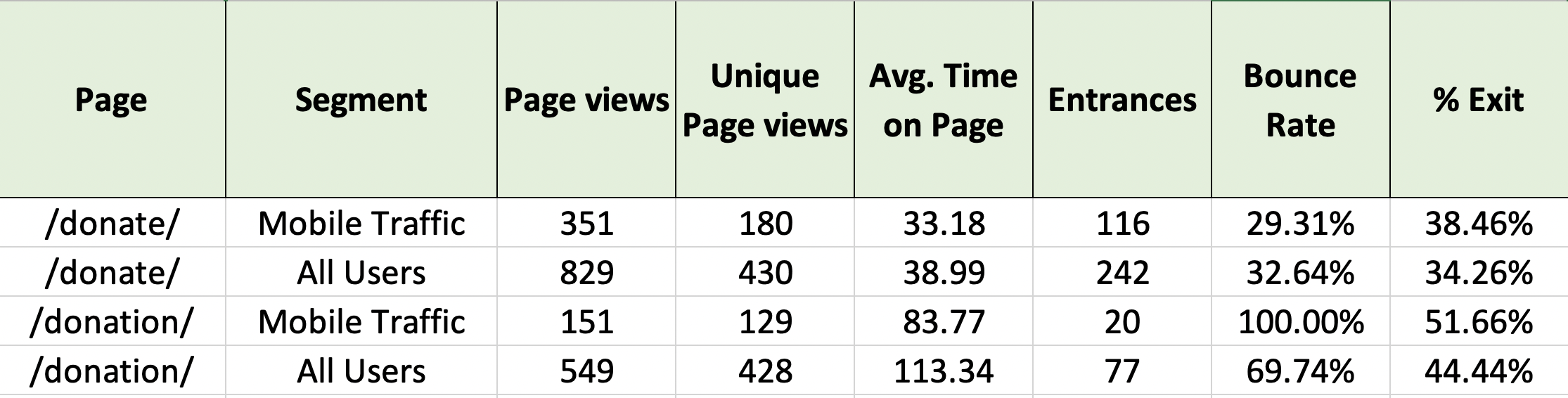
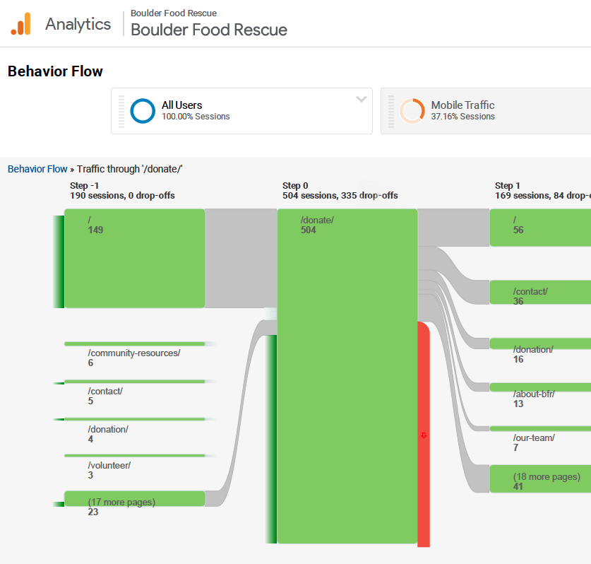
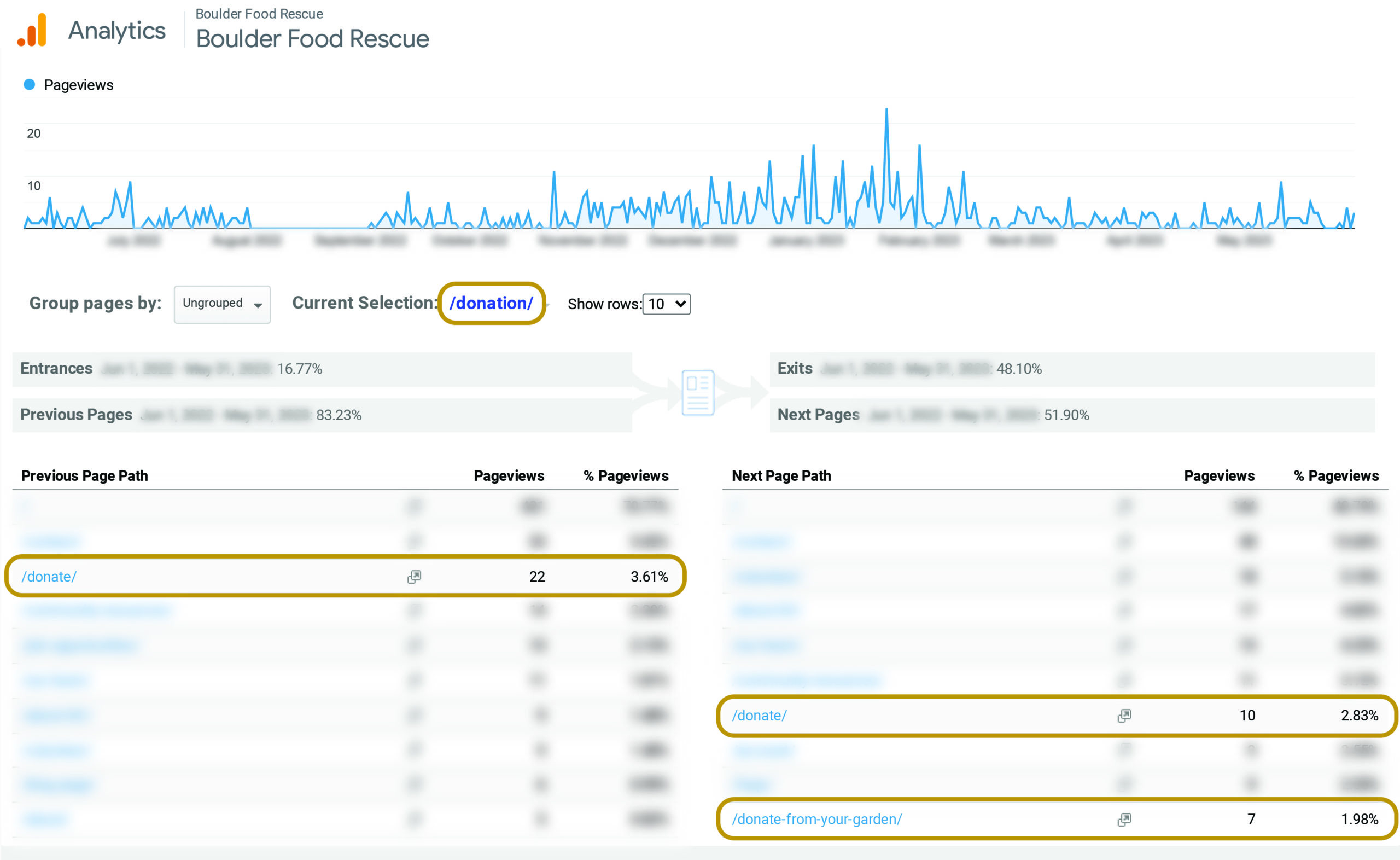
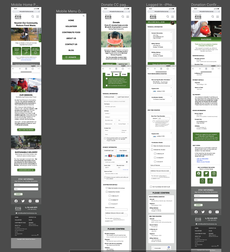
Analyzing Google website analytics provided valuable insight into user behavior. I discovered that many users were accessing the outdated “/donate” page instead of the newer “/donation” page. Additionally, I identified duplicate pages on the same topics, which can cause confusion for users.  

I also studied drop-off points and areas of apparent failed navigation.  For example, many people quickly navigated from the donate page to the page for donating food, suggesting that they actually wanted to learn about donating food instead of money.

We reviewed other donation sites to see how they were addressing challenges. This image shows a screenshot of Cancer.org's homepage
We reviewed how other donation sites were addressing the issues that we were trying to solve.
COMPETITIVE ANALYSIS

We reviewed the “competitors” to understand trends and user expectations.​

We completed a review of other regional and national nonprofits and how they addressed the donation pages.  This shed light on industry best practices and allowed us to identify areas where BFR’s website was falling short.

We found very valuable secondary research in NextAfter's study, "The Nonprofit Mobile Donation Experience Study: What We Learned from Making 135 Mobile Donations,"
SECONDARY RESEARCH STUDIES

I identified best practices and the UI details that would increase donations.​

Notably, NextAfter’s study, “The Nonprofit Mobile Donation Experience Study: What We Learned from Making 135 Mobile Donations,” provided valuable and enlightening findings, helping us understand research on how to maximize donations.

This knowledge informed my approach to creating a more effective and user-friendly donation experience.

A slide from NextAfter's study showing a 69% increase in donations with the use of a sticky donate button.
NextAfter’s study showed a 69% increase in donations just by using a sticky donate button on the homepage!
from Nonprofit Mobile Donation Experience Study published by NextAfter, 2023
BUSINESS OPPORTUNITIES

I explored how improving the donation experience would benefit the organization and its bottom line.​

  • Improving the donation experience would benefit the organization by:
  1. Increasing donations: A streamlined and user-friendly online donation system can make it easier for supporters to donate to the organization, potentially resulting in increased donations.
  2. Improving the donor’s experience: A user-friendly donation system can help to build stronger relationships with supporters and encourage repeat donations.
  3. Reducing cost: Online donation systems are typically more cost-effective than traditional fundraising methods, as they require fewer resources and staff time to process donations.
  4. Expanding the donation base: A well-designed online donation system can help reach new donors who may not have been aware of the organization’s mission or previous donation opportunities.
  5. Increasing visibility: Including social share links can help increase the organization’s visibility, as donors can easily share donation links with their social networks, reaching a wider audience.

+ Phase 2: design

REDESIGNING A USER-FRIENDLY EXPERIENCE

Armed with insights from research, I embarked on the design phase.

  • I led the redesign of Boulder Food Rescue’s food rescue donation experience, working in collaboration with my team of 3 UX researchers. With our research insights in mind, I delved into the design phase.
MY DESIGN SOLUTIONS

I evaluated the issues and devised the following solutions:

"Using Design Strategy to Improve Donation Conversion Rate". Donation Funnel before vs. after. Before the updates, fewer donors had awareness, which led to fewer donors having intent or consideration, and fewer people actually donating. Before, there was challenging navigation and reduced contributions, and after, there was an intuitive process with amplified donations.
The new design increases awareness of BFR's mission and eliminates obstacles to donating. These combined improvements result in a boost in donation rates.

Before: Challenging Navigation, Reduced Contributions

After: Intuitive Process, Amplified Donations
Medium fidelity wireframes in Figma. Many comments from the other team members appear on wireframes.
MY DESIGN PROCESS

I created multiple iterations of wireframes and prototypes.

  • I began with simple low-fidelity wireframe sketches of various layouts for the mobile homepage and donation pages.  I continued exploring and refining these until I found the solution that I thought would work best.  I then created a simple wireframe in Figma to share with my remote team and get feedback. 

    Once we had agreed on the layout, I moved on to medium and then high-fidelity prototypesCollaborating closely with my team of UX researchers for feedback and iterative refinement, I continued to refine each new iteration based on their feedback. 

As the prototypes became more refined, I began writing the strategic copy for the donation flow.

  • My team provided feedback until we had crafted messaging to our satisfaction.  We also examined the form field labels to ensure they provided clear and concise instructions.

+ Phase 3: user testing

TESTING THE PROTOYPE

We tested our Figma prototype with users to gather valuable feedback and validate our design decisions.

Method:

💬

moderated usability tests

For this study, we conducted five moderated usability testing sessions with participants between the ages of 30-70.  We followed a script with tasks and open ended questions.

Study Goals:

🔎

validate design
Validate design changes made to the prototype homepage, including a new Call to Action (CTA), mission statement, and other updates.

🎯

validate content
Validate the content and overall user experience of making donations.

🤔

uncover confusion
Identify any confusing or frustrating areas of the donation process.

🚀

prioritize changes
Identify high-priority adjustments that can be made to improve the donation process.
INSIGHTS

The user testing was overall very positive and all users were able to successfully make a donation through the prototype, but they provided very valuable and often surprising feedback.

    1. Test participants reacted positively to the sticky donate button feature and said that it provided easy navigation without being intrusive.
    2. One user did not realize that they could scroll down below the three buttons on the homepage.
    3. Much of the negative feedback was regarding specific language. For example:
      • Two of the participants reacted negatively to the Header “Join the Movement”
      • Some study participants thought phrases like ““Redistributing Power”, “Food Insecurity”, “Food Justice” sounded like jargon.
    4. Users like to know how their donation will be used and they like clear language.
      • People felt that phrases like “Every $1 donated helps provide $8 worth of groceries to people facing food insecurity” provided clear examples of how their donation would be put to use for maximum impact.
    5. One user felt that the section on the homepage about “supporting nonprofits” was confusing.

Some study participants thought phrases like “Redistributing Power”, “Food Insecurity”, “Food Justice” sounded like jargon.

Participants appreciated clear examples of how their donation would be put to use for maximum impact.

Some participants reacted negatively to the phrase “Join the Movement”

+ phase 4: design iterations​

REWORKING THE DESIGN​

We synthesized the participants’ feedback and agreed on priority changes for the final prototype.

These changes included:

  1. Removing the section about “supporting nonprofits”.  We agreed that this information should be moved to BFR’s new website specific to their work with other nonprofits.
  2. Editing the copy that some users found unclear or confusing.
  3. I edited the layout of the home page to make it clear that there was more information below the fold.

In addition to these changes, I also completed an accessibility audit and corrected the color contrast to confirm to WCAG (Web Content Accessibility Guidelines) AA standards.

Lastly, I created versions of this design for other platforms like desktop.

A screenshot of the Figma mobile prototype after design iterations

+ Phase 5: Presenting our findings

REPORT & SLIDE DECK PRESENTATION

We created a very detailed report of our research and developed a slide deck to present our findings to stakeholders at Boulder Food Rescue. ​

The stakeholders were thrilled with our research & prototypes. They have already made some suggested changes to their website and plan to implement more when time and funding are available.

the table of contents for the very detailed report that my team wrote to document the UX research
My team wrote a detailed report to document the UX research.
Result
Conclusion

Based on the user feedback, it is our belief that the redesigned, user-friendly homepage and a streamlined donation process will lead to increased website traffic and donations

By providing clear, motivating content and improving the mobile and desktop donation experience we aimed to empower Boulder Food Rescue to further reduce food waste and provide more healthy food to underserved communities.
The Final Prototype

Have a look around the final Figma prototype:

FUTURE RECOMMENDATIONS

A comprehensive website is needed when funding permits.

  • Looking ahead, there is a compelling need for a comprehensive website overhaul to optimize the entire user experience and refine the information architecture. Given the site’s substantial growth beyond its original purpose, a complete redesign is warranted, and I propose initiating this process with card sorting exercises to gain deeper insights into user expectations regarding information architecture.
  • As BFR has also expanded its mission to educate other nonprofits, they have initiated the development of a sister website, FoodRescueAlliance.org. To enhance clarity and the overall user experience, I recommend consolidating scattered information from the main site to the new platform. This strategic move not only benefits users in Boulder but also offers global users seeking assistance in establishing similar nonprofits a more streamlined and accessible resource.
Shopping Basket