

UX/UI Design in Raleigh NC
To increase visibility for a Raleigh coffee shop, I developed a cohesive brand identity that included a refreshed logo, new color palette, and bold updated signage resulting in attracting new customers.
In addition, I designed retail fixtures at the point of purchase, improved customer flow, redesigned the menu board and added outdoor seating to encourage customers to stay longer. These three changes together resulted in a significant boost in the average ticket price and a substantial increase in-store revenue.
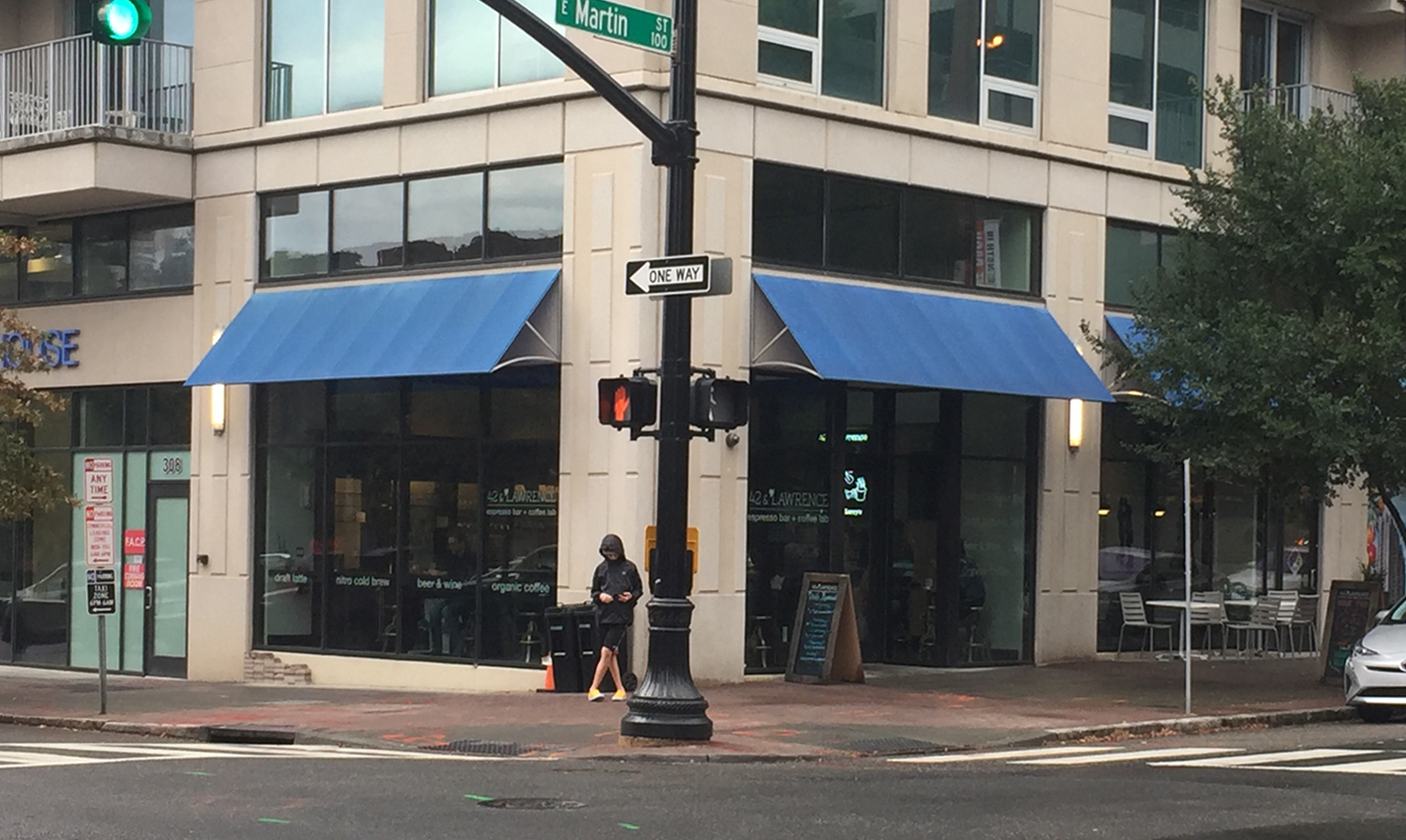
42&Lawrence is a high end coffee bar in downtown Raleigh, NC serving locally roasted, organic coffee from Larry’s Coffee. The client sought a way to make it stand out in a crowded market. The location of the coffee bar, in a skyscraper, with an unremarkable exterior and a reflective glass storefront made it difficult for potential customers to notice it from the street. The client sought to increase visibility, attract more customers and increase the average ticket price.
CLIENT: 42&Lawrence (shop) / Larry’s Coffee (parent company)
PROJECT DURATION: 6 months
How might we increase visibility of the storefront?
How might we raise the average ticket price?
How might we leverage the renovated park across the street to attract new customers?
How might we maximize the interior flow to encourage customers to stay longer & spend more?
ASSESSMENT
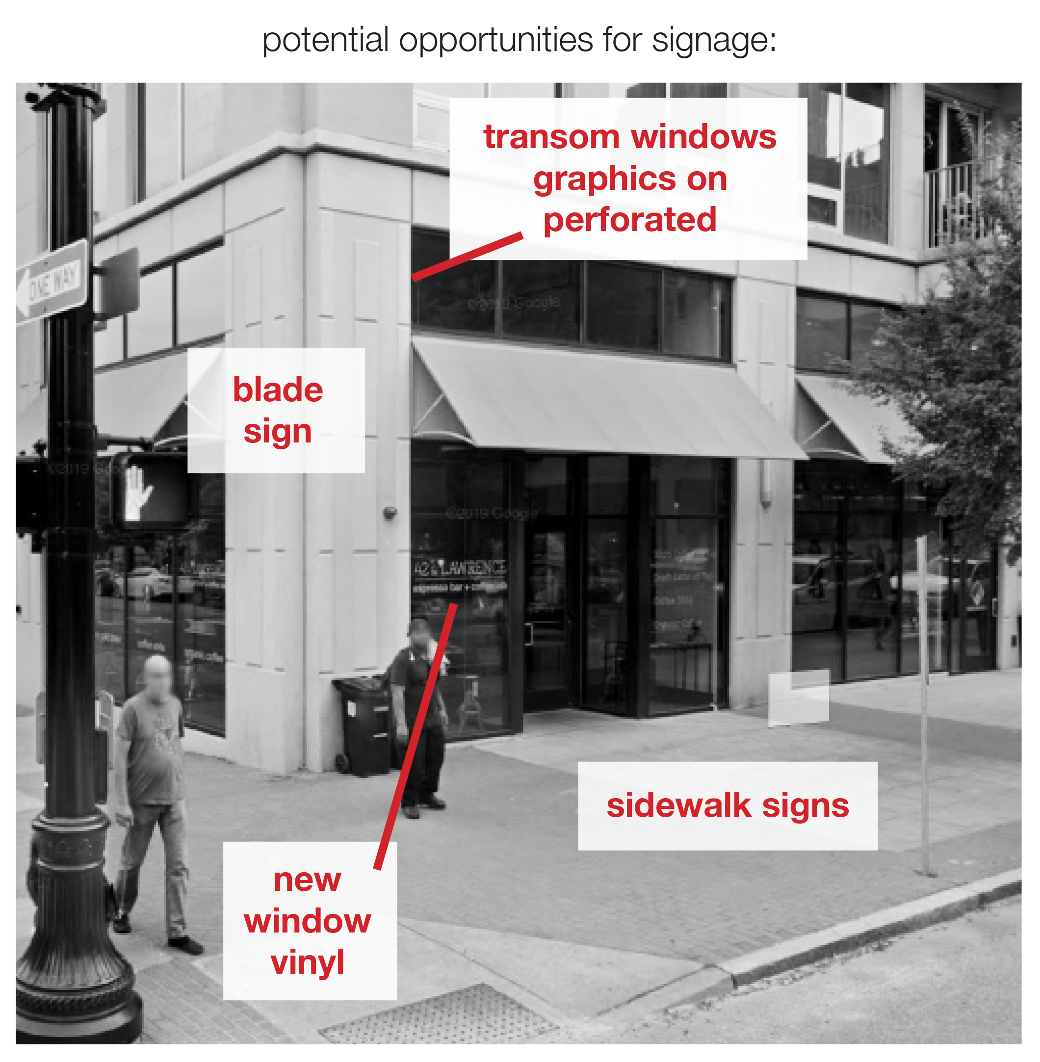
I began the research process by looking for areas of improvement that would increase visibility. I analyzed the storefront and identified several potential opportunities for signage on the exterior.
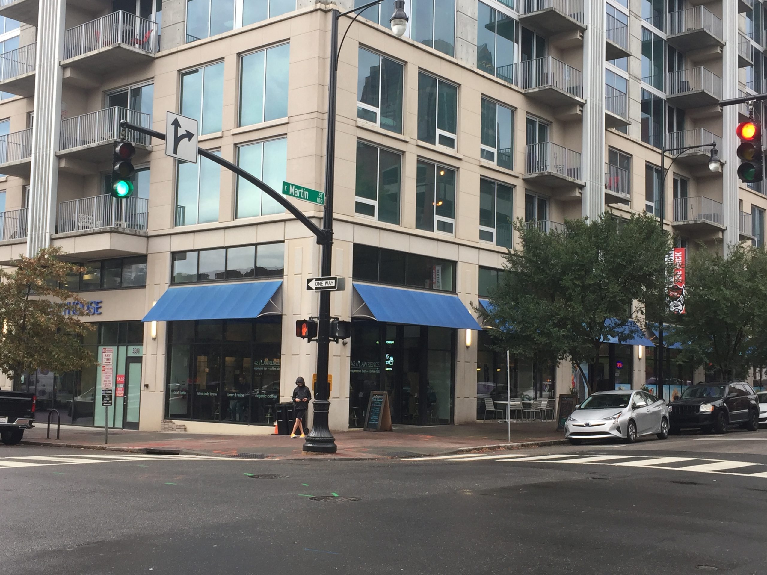
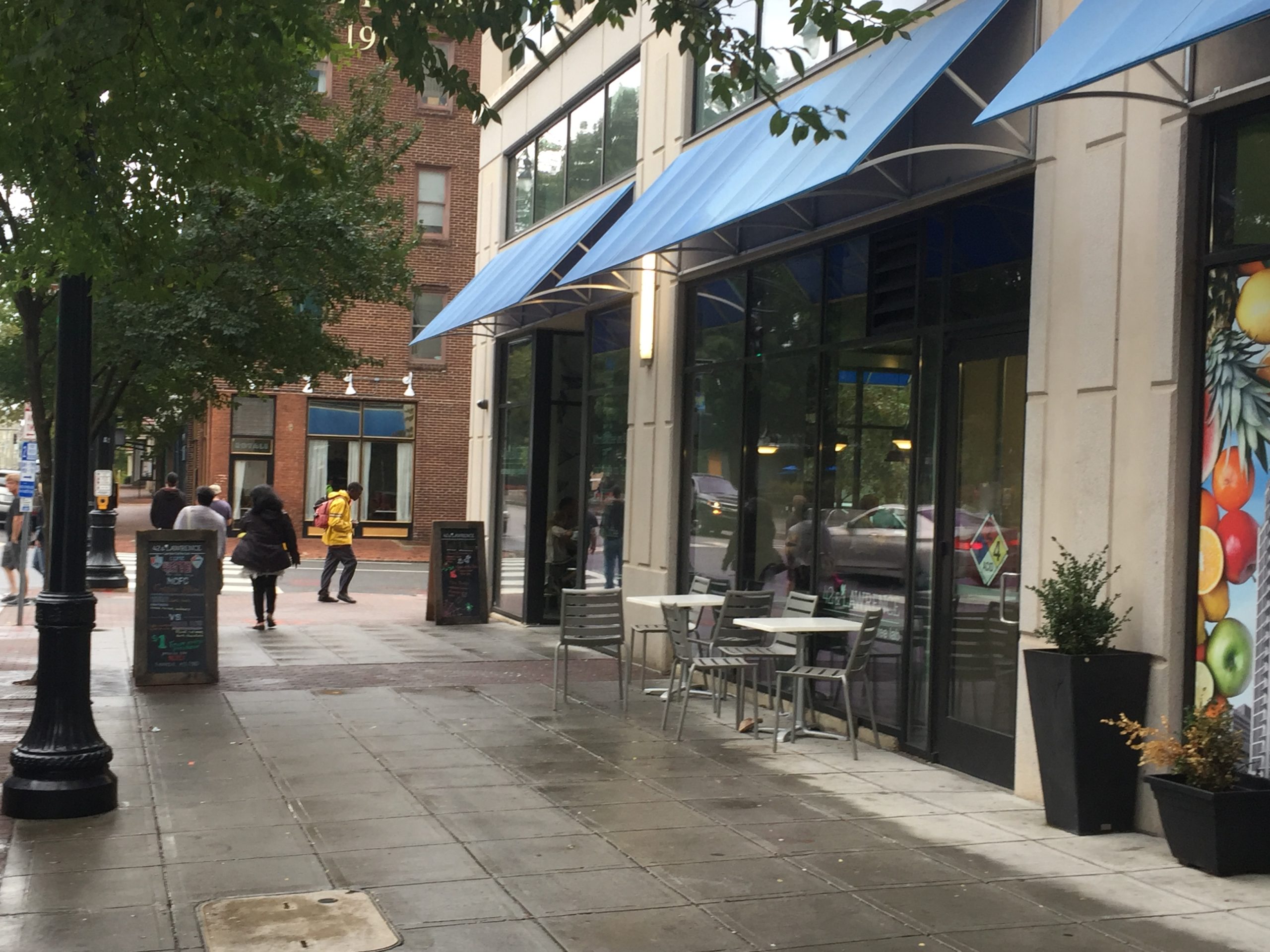
Upon completing a competitive analysis, I noticed that the most inviting restaurants and cafes had a defined outdoor seating area. Our cafe had very minimal outdoor seating. There was nothing separating it from the street, which felt unprotected and uninviting. And it was often used by non-customers.
With very little interior seating, not using the wide sidewalks in front of the coffee bar, was a huge missed opportunity. Adding seating would serve to increase visibility, make room for additional customers, and encourage them to stay longer, thereby increasing the average ticket sale.
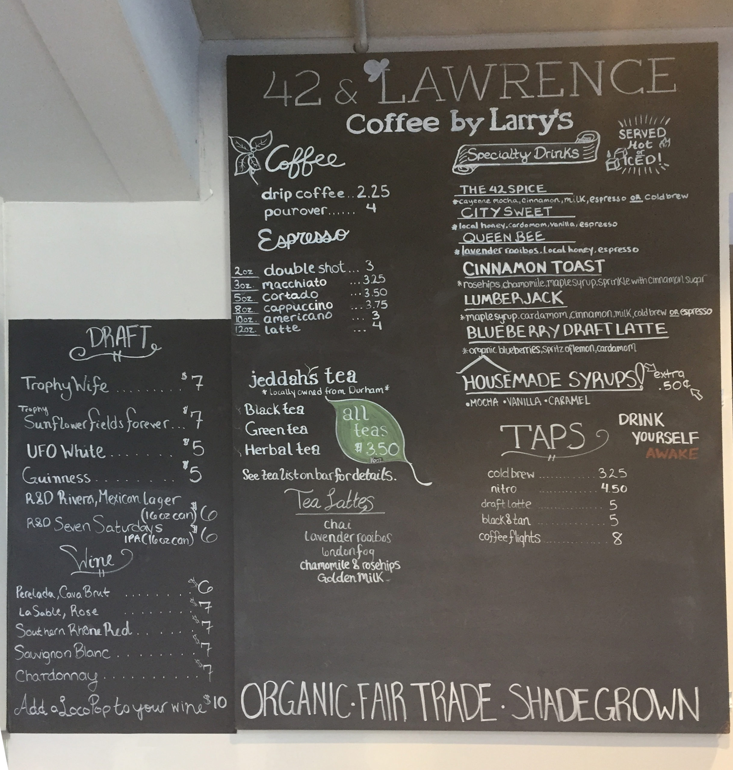
Turning to the interior, the original menu board had been replaced by a chalkboard as the menu evolved, which did not fit the upscale interior or “vibe”. Interviews, user testing, and observation found that there was also a bottleneck in taking orders when the cashier/barista had to answer a lot of questions about the menu.
After executing a competitive analysis of other local coffee shops and restaurants, I determined that our visual identity needed to be bold, colorful and make it very clear that 42&Lawrence is a coffee bar, above all else.
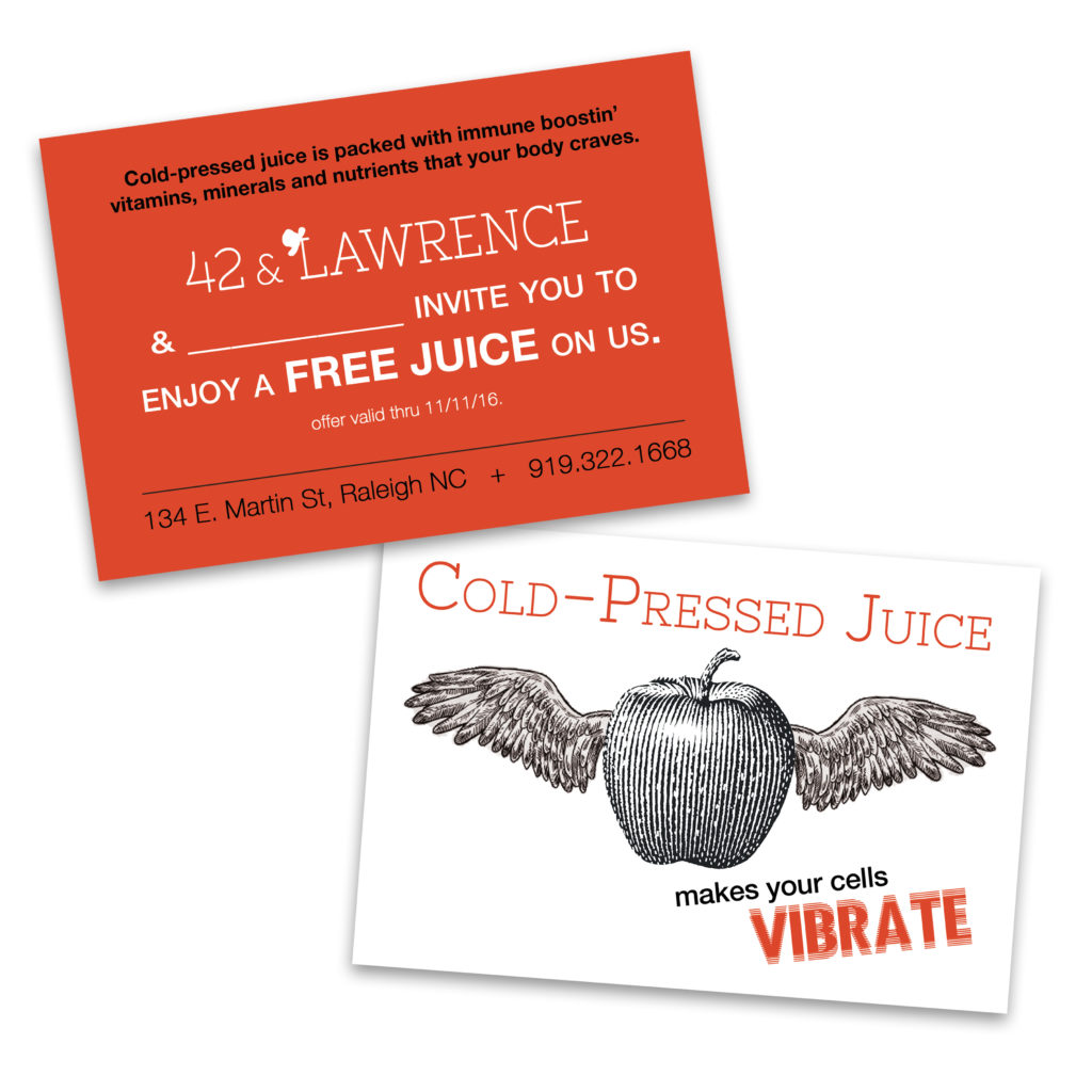
Next, I conducted a thorough review of past successful branding projects and revisited a postcard that I had previously created for the client. During this process, I identified a few key elements that particularly resonated with the company’s evolution and ethos:
Ideation and exploration
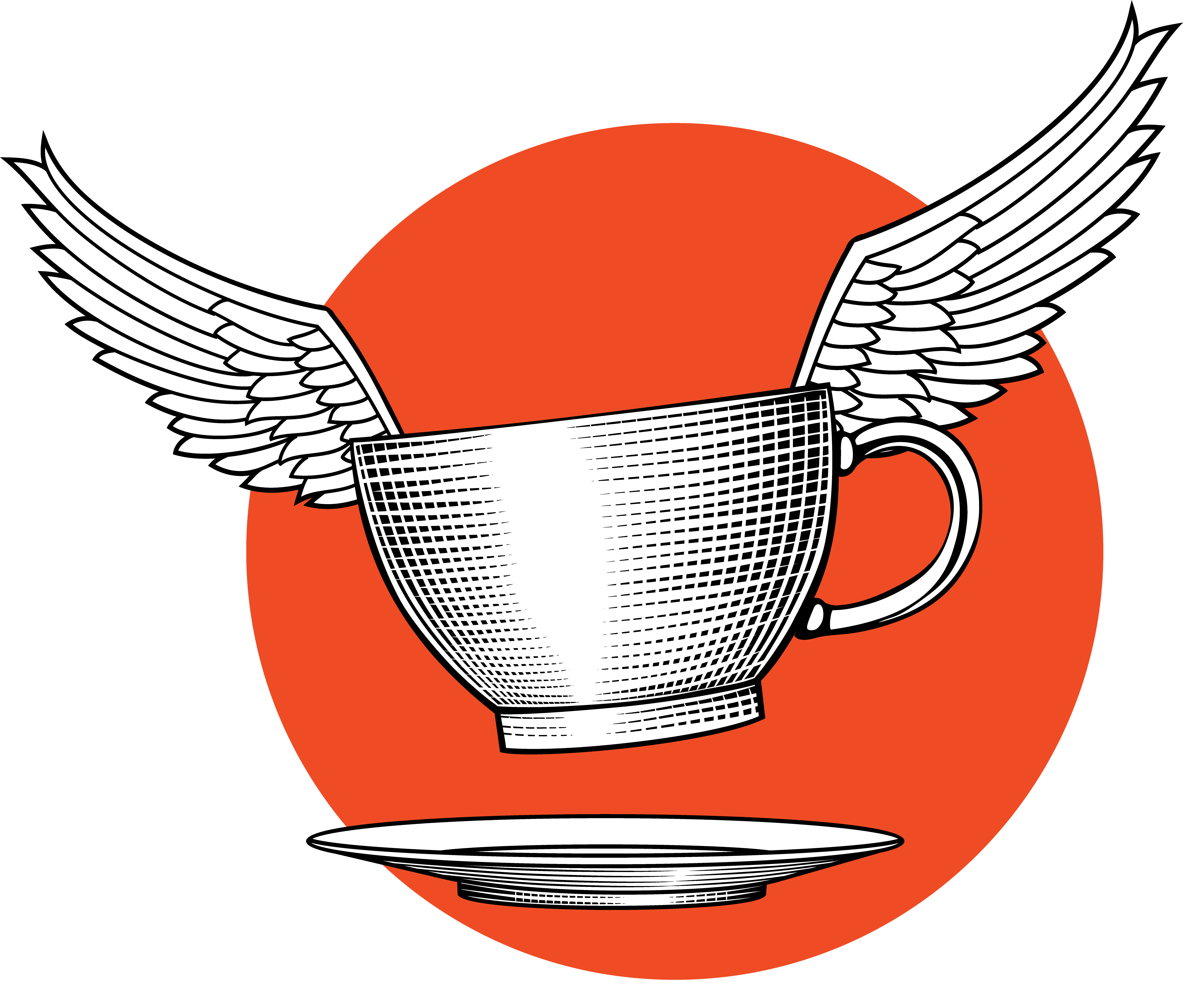
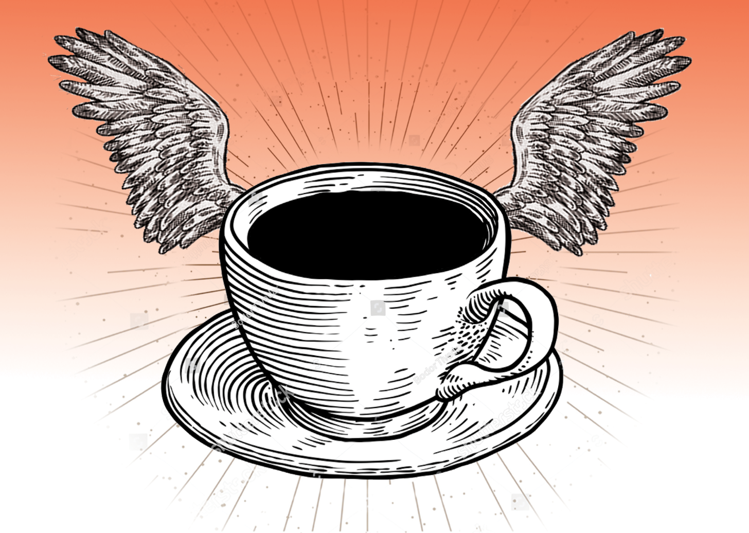
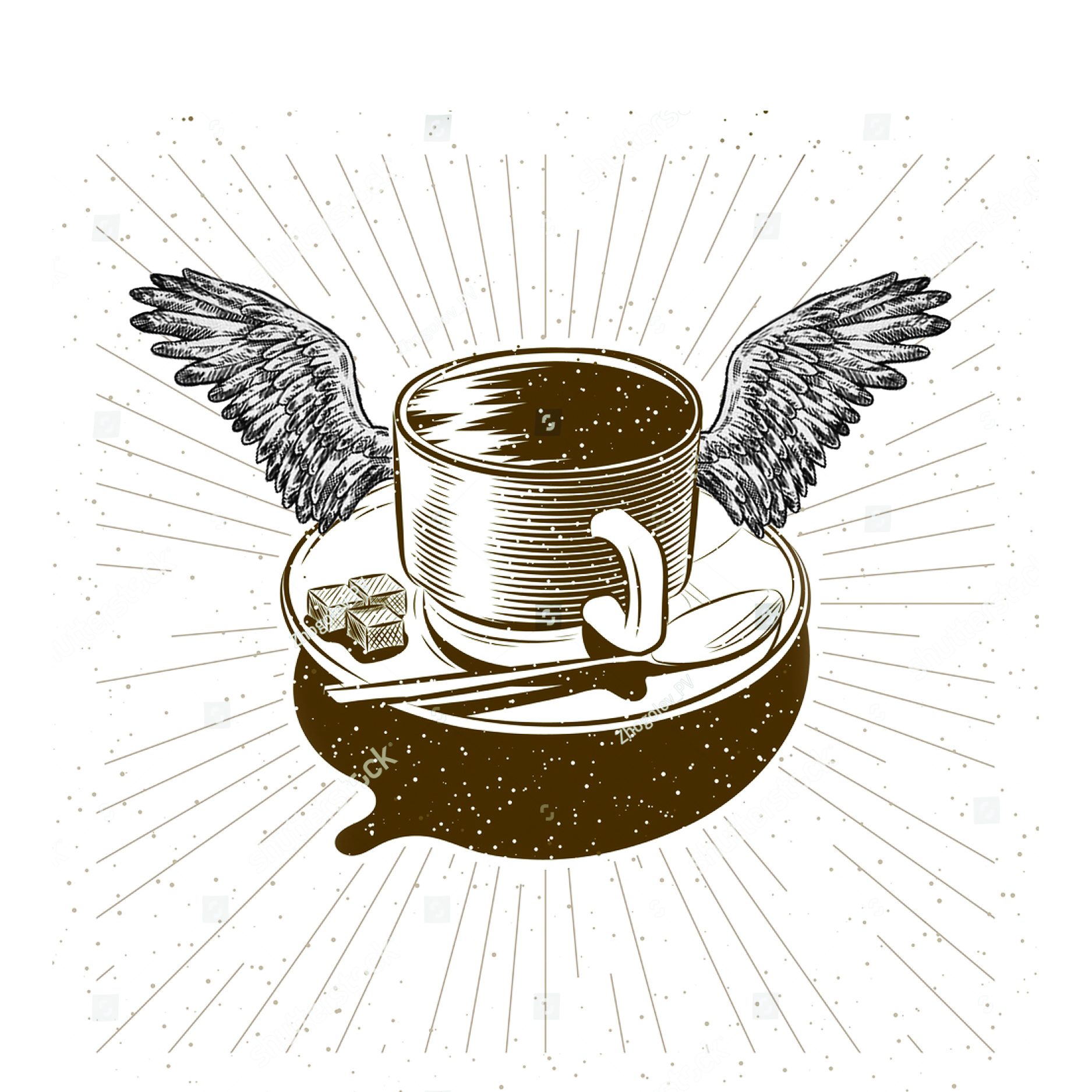
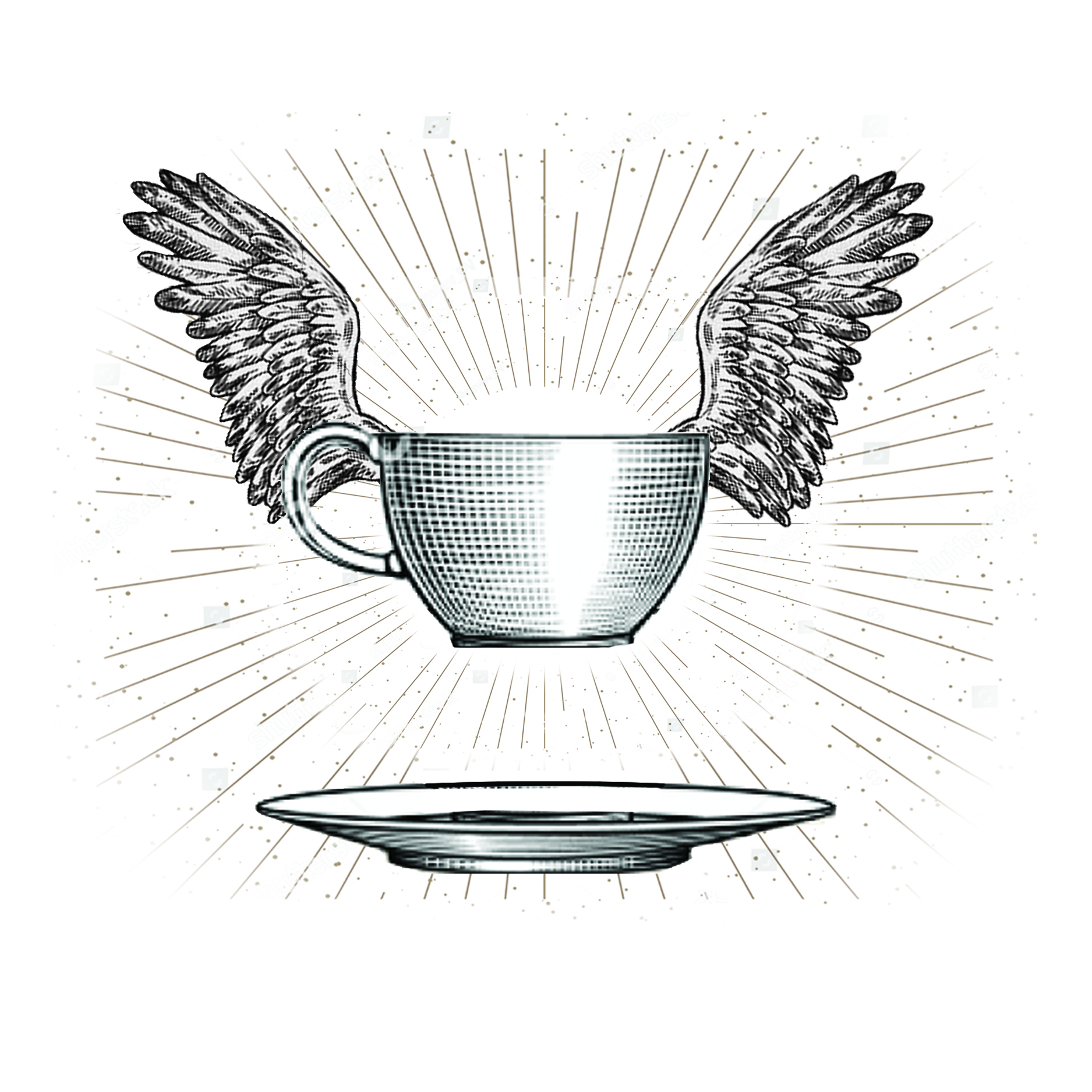
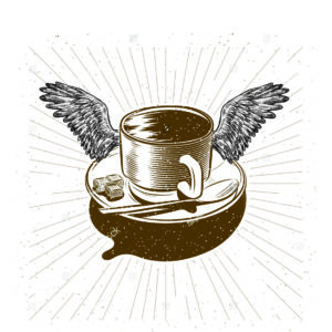
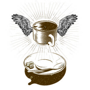
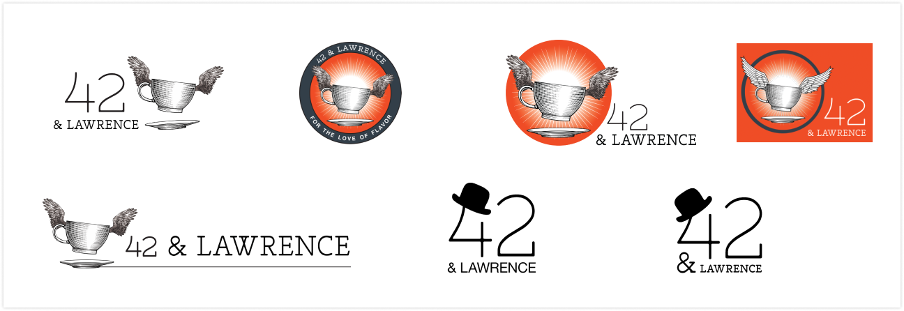
In these early concepts of developing, I was drawn to the idea of a cup lifting off a saucer to convey a sense of elevation and a “heavenly” cup of coffee.
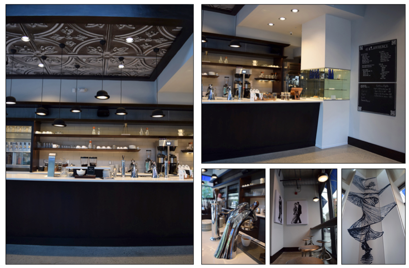
The client liked a retro diner style, however I felt that it did not align with the interior aesthetic, which combines early 20th century design elements with a contemporary twist.
After a couple of rounds of ideation, we liked the general concept and were ready to refine the design. I simplified the design making it bold and easy to read from a distance or when riding past in a car or on a bike.


LOGO DESIGN
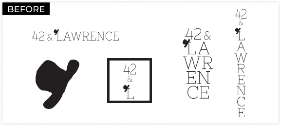
PROBLEMS: The original logo presented scaling issues due to its light font-weight, making it challenging to read from a distance even when spanning across large windows. Furthermore, the font lacked alternative weights, limiting its versatility.
What’s with the hats?
Larry, the founder of the coffee bar and its parent company, Larry’s Coffee, opened his roasting company in the 90’s. He is locally known for often wearing a bowler hat. When designing the interior, I had included bowler lights above the bar and patrons loved them.
The hat element in the original 42&Lawrence logo (designed by a marketing agency) was a direct carryover from the branding of Larry’s Coffee. While it feels fun and playful in Larry’s branding, this design element didn’t align with the elevated concept of the coffee bar and needed to be reconsidered.
Ideation and exploration
I explored several logo designs that incorporated a similar, but more versatile font. I experimented with using the winged cup concept as part of the logo. I also considered a refined version of the hat concept to tie in with the original logo.
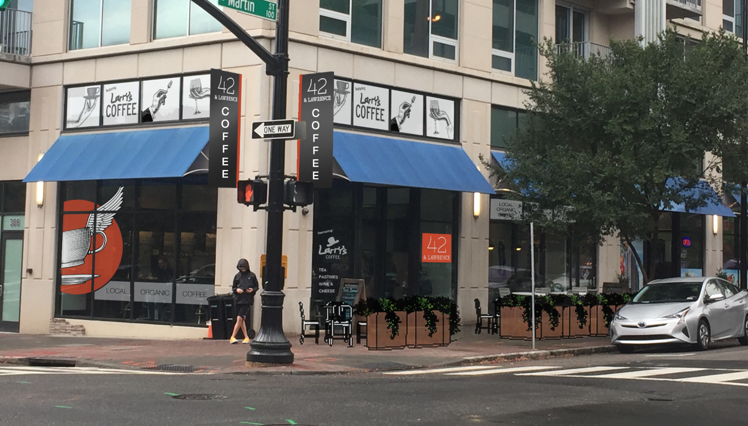
I developed visual renderings of the exterior to explore ideas, confirm color and scale, and determine how different elements worked together. These also served to showcase to the client and stakeholders the potential impact of the proposed changes.
I used a combination of programs including Adobe Photoshop, Illustrator, and SketchUp (a 3D modeling software) to add in planters to define an outdoor seating area. This functions much like a prototype for a digital product. It allows us to get user feedback and a quick and convenient method to better visualize how the finished result might look and feel.
Turning back to the interior, the menu board needed some love. Many of the interior details are inspired by early 20th century design with a modern twist. We returned to this inspiration for the design of the menu board.
(Here are a few design ideas that we explored.)
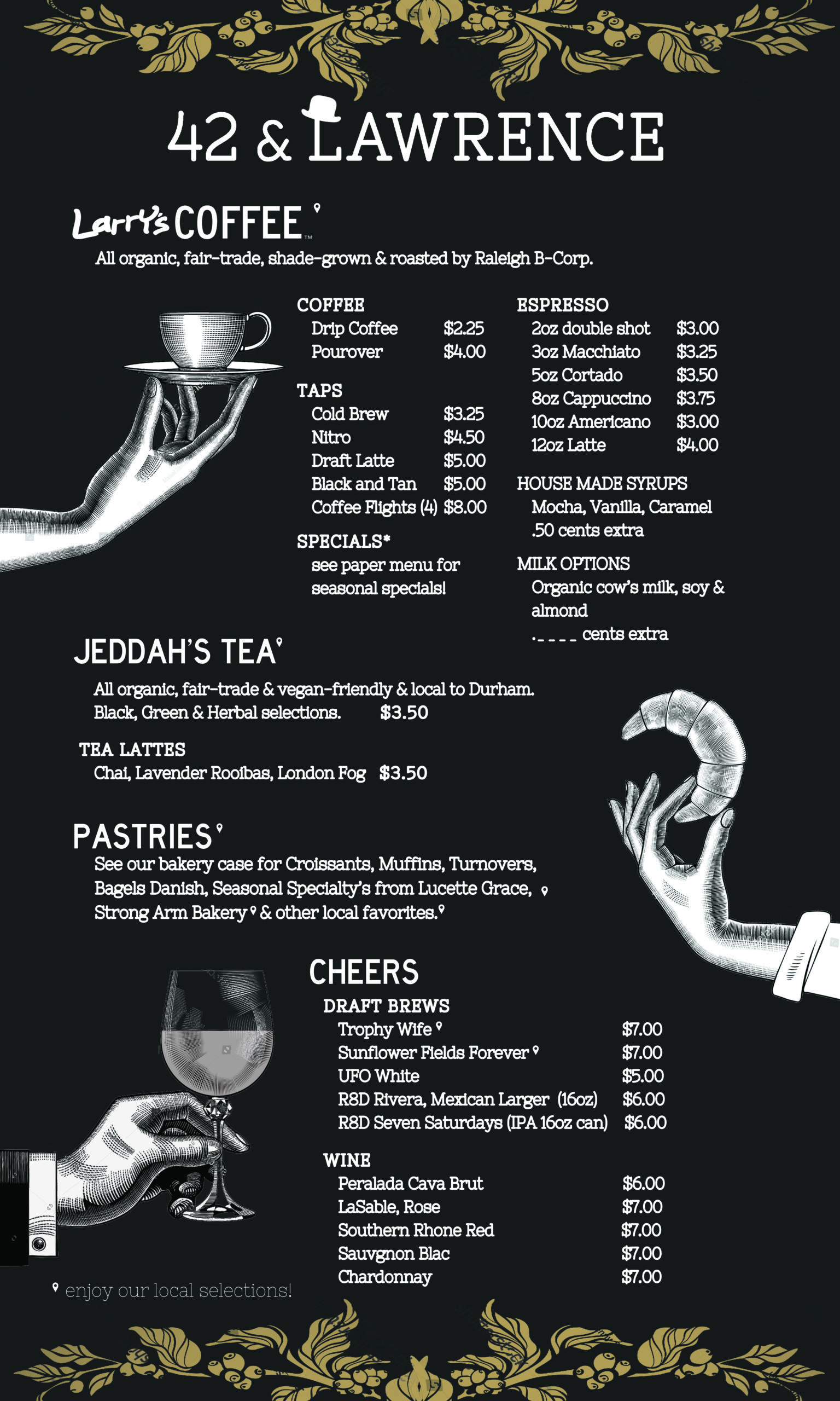
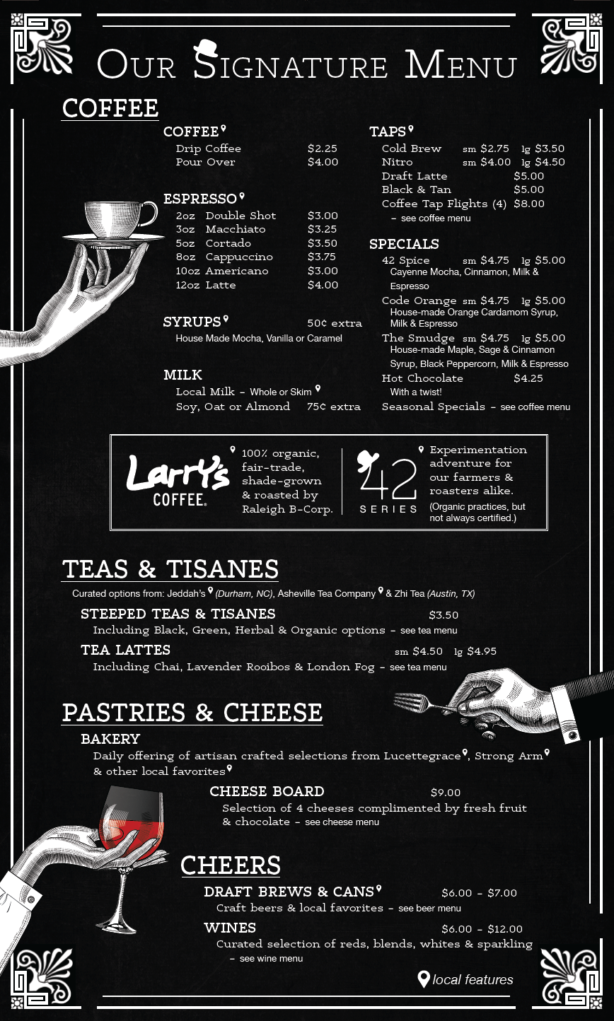
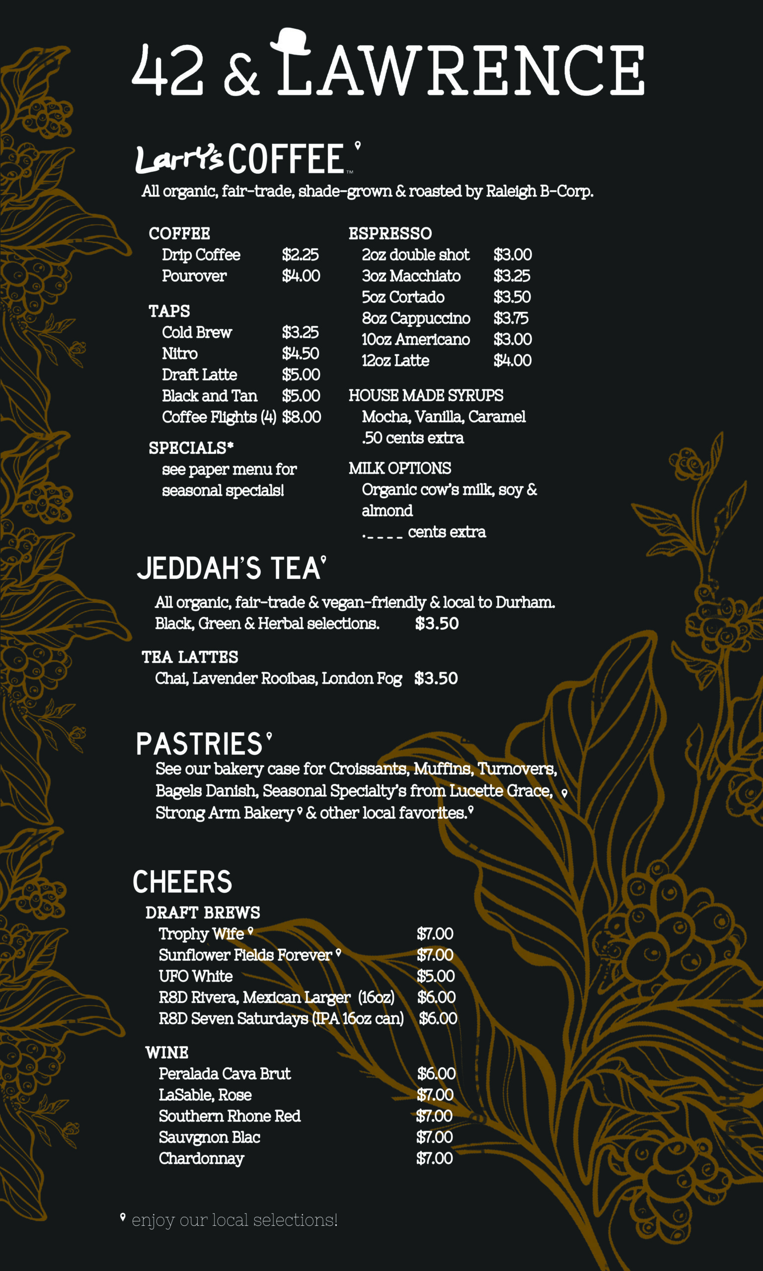
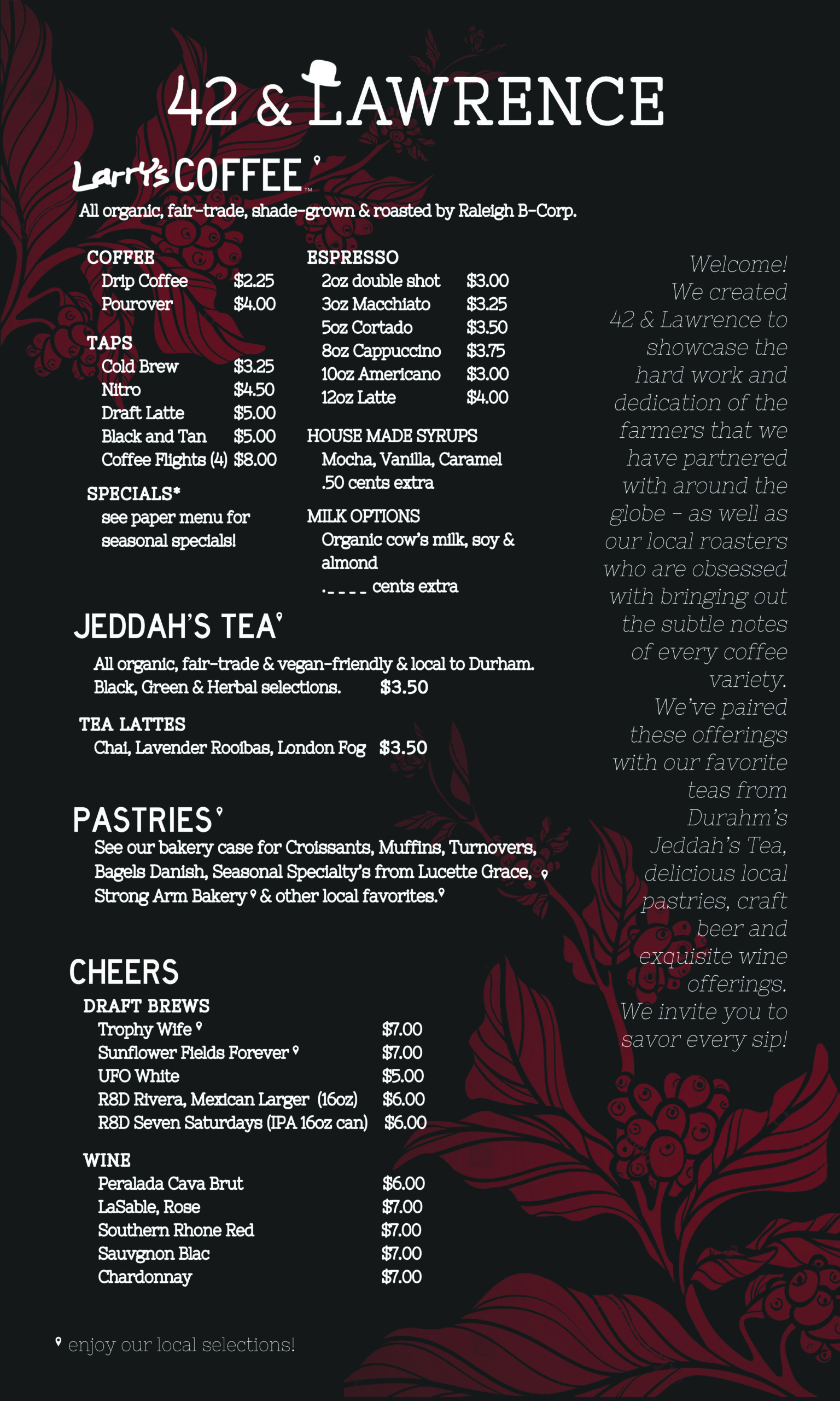

We moved forward with a design that related to the branding of both companies, Larry’s Coffee and 42 & Lawrence.
Our design had a modern look with vintage touches and a layout that users found intuitive and easy to navigate.
The vintage hands holding a cup, a fork, and a glass of wine helped call attention to the new menu offerings of food and wine in a fun and playful way.

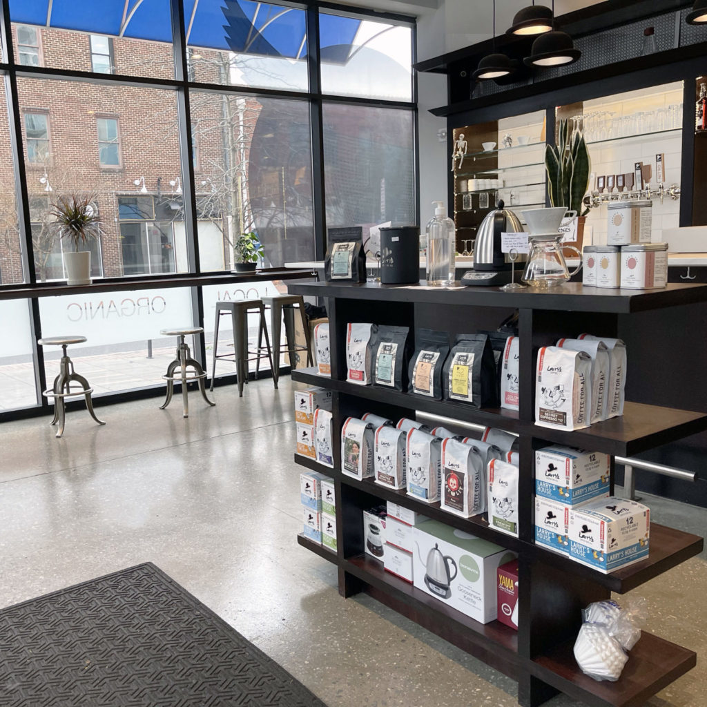
In order to increase sales at the point of purchase, we wanted to add a merchandise display. This would double to direct customer flow.
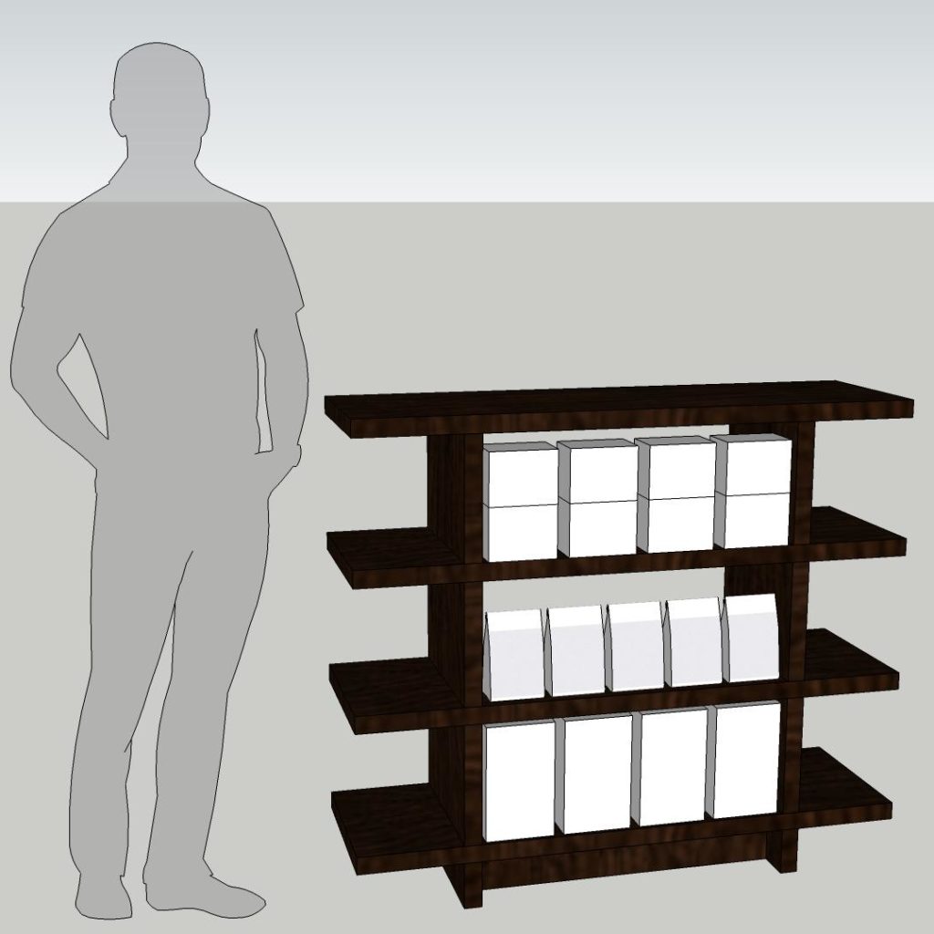
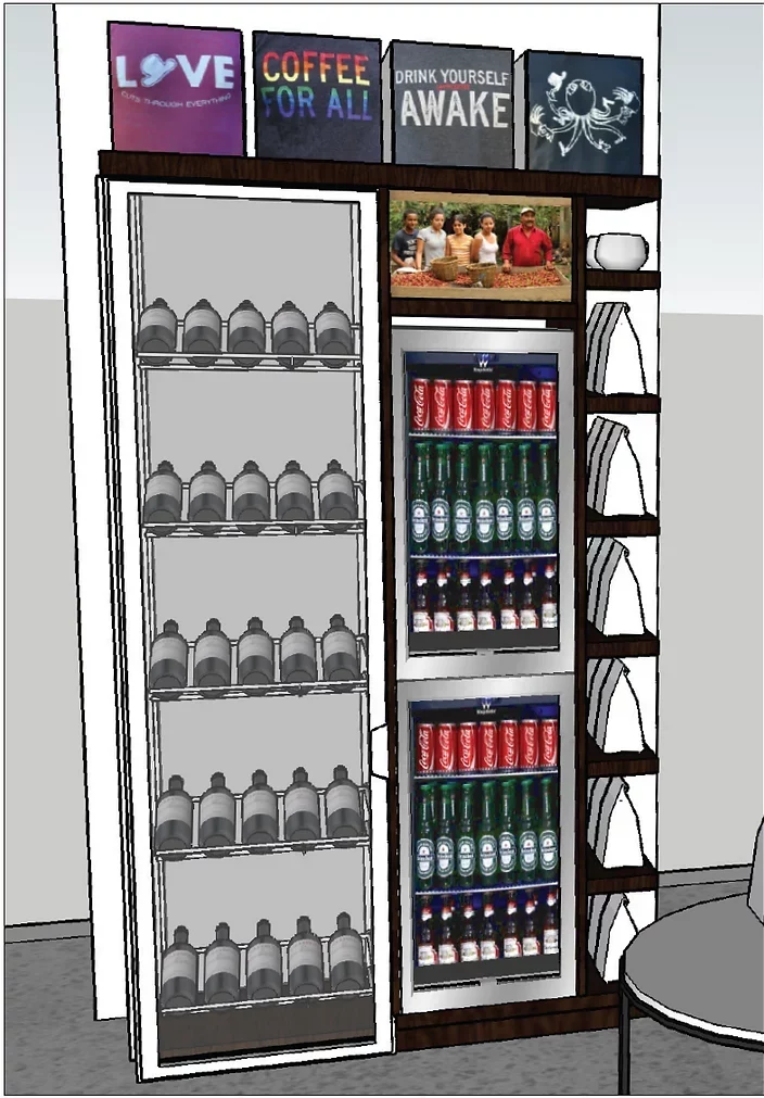
We also explored a small condiment and refuse station, as well as a wine and refrigerated merchandise display. These ideas did not make it in the MVP (minimum viable product).
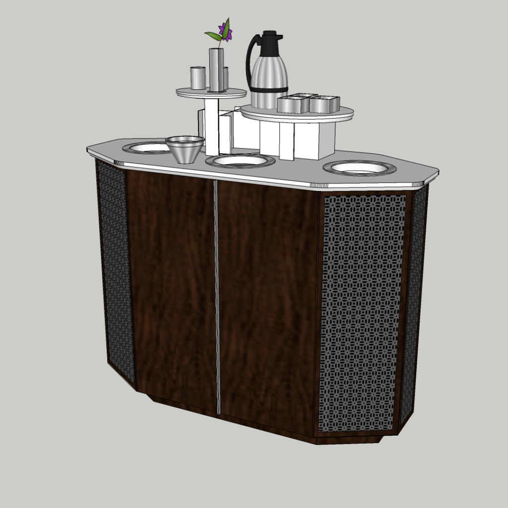
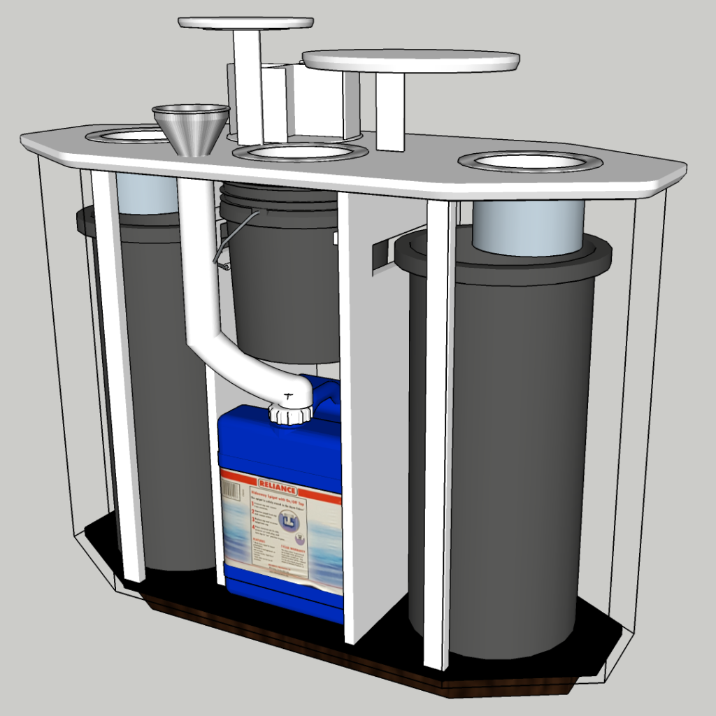
The point-of-purchase retail display worked out exactly as planned and increased revenue immediately by making it easy for users to pickup bagged coffee and other merchandise.
The defined outdoor seating area doubles the available seating creating a cozy feeling.
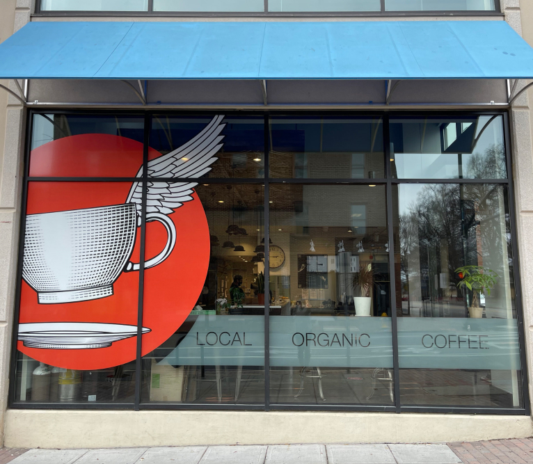
And the new logo is much easier to read from a distance, while keeping the intentions of the original logo.
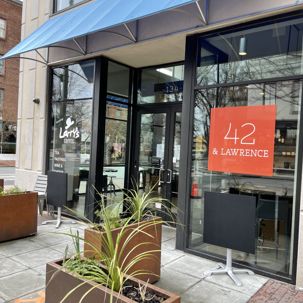
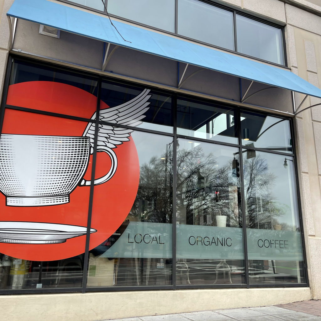
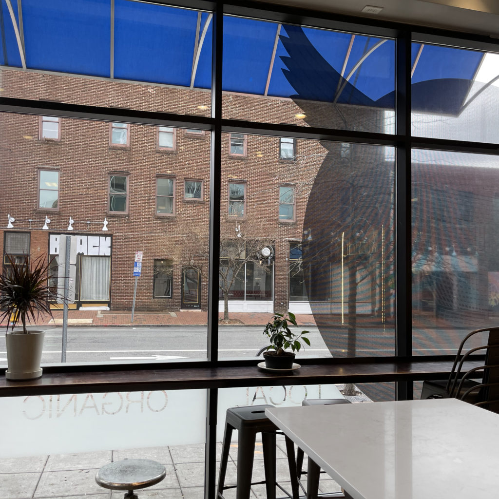
The large graphics don’t block the view from inside the space as they are printed on perforated vinyl.
The frosted border serves double duty. From the exterior, it emphasizes the niche of locally roasted, organic coffee, while inside, it acts as a privacy panel for customers sitting at the barstools.
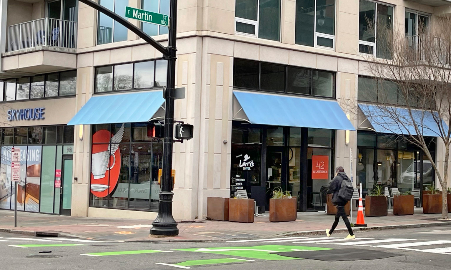
The new window graphics, revamped logo, and defined outdoor seating area are much more welcoming from a distance and easier to read at a glance. They also more clearly identify the location as a coffee bar.
This led to a huge increase in foot traffic and store revenue! They are selling about 30% more coffee than before the brand updates!
User feedback has been stellar. The stakeholders were thrilled with the result and a neighboring business asked for my help with a similar project. All in all, a resounding success!
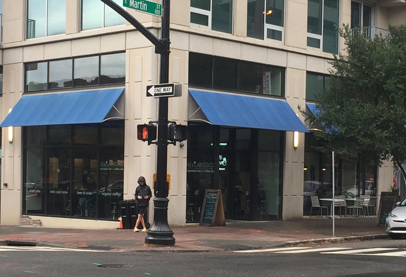
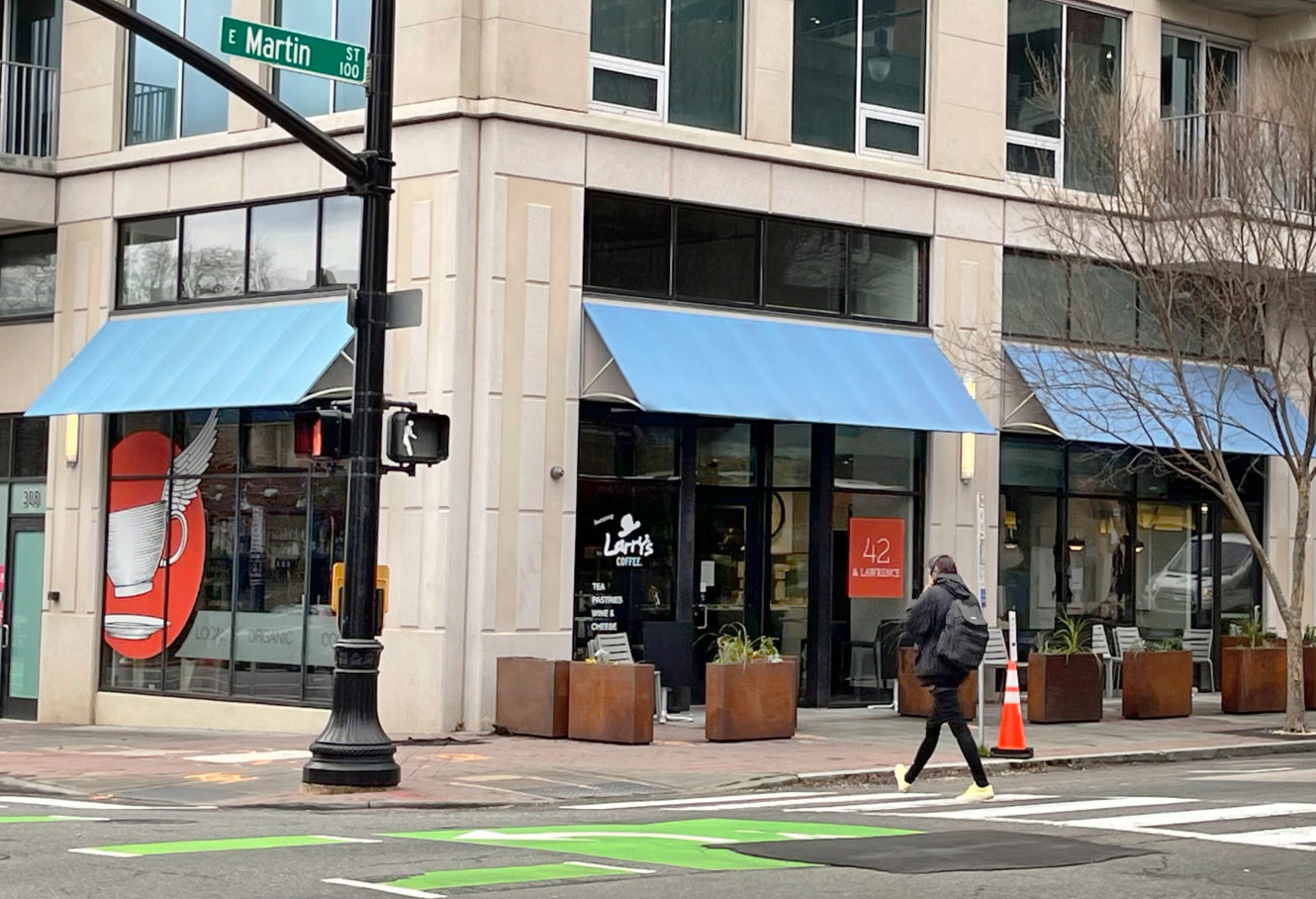
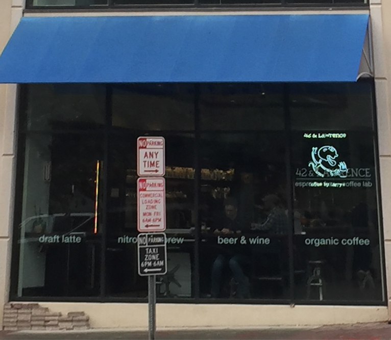

Drag the white dot slider to see the before and after of the exterior!
BEFORE:
AFTER:
